Brand Design for mium
Every brand begins with an idea before it takes shape.
For mium, that idea was Inspirierende Intelligenz—an approach that places people, rather than technology, at the centre of the brand. From this perspective emerged a visual identity that makes trust tangible.
Artificial intelligence has no physical form. It is
abstract by nature.
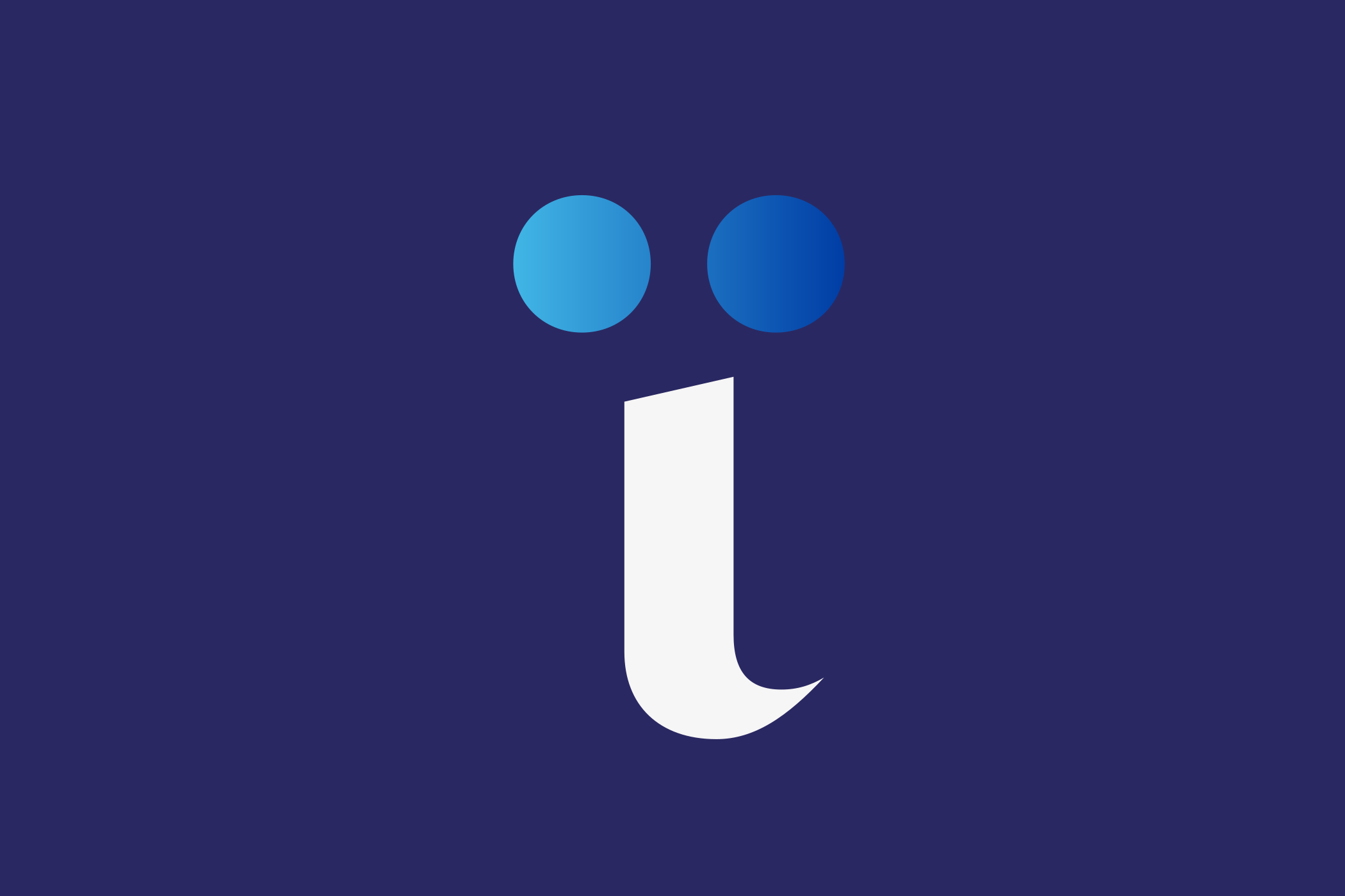
Rather than illustrating technology, we chose to humanise
it. The visual identity begins with humanity’s oldest form
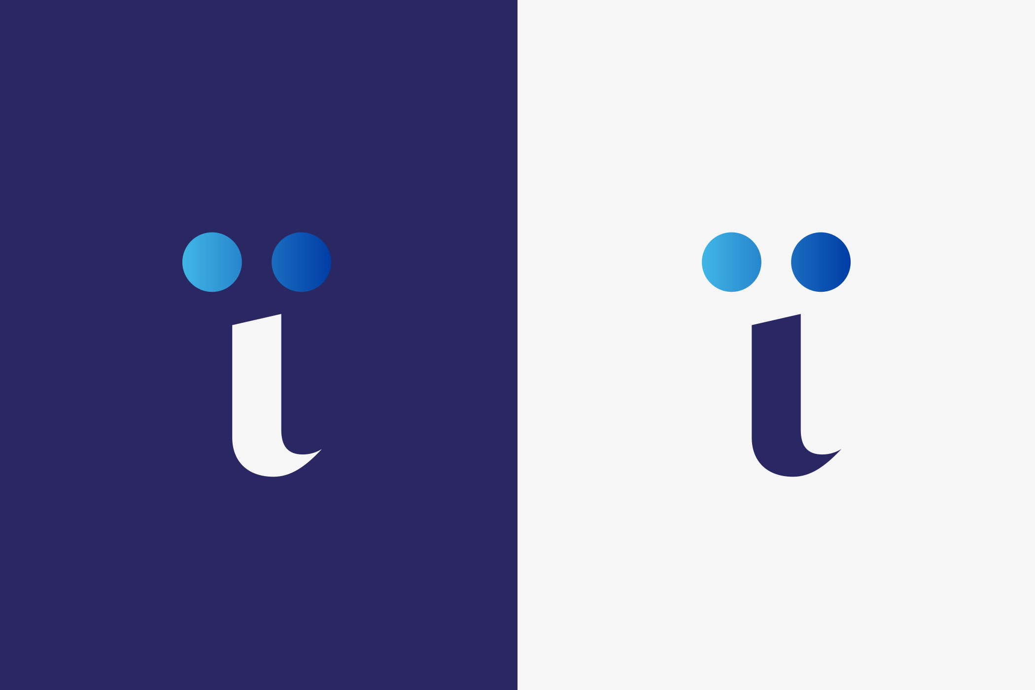
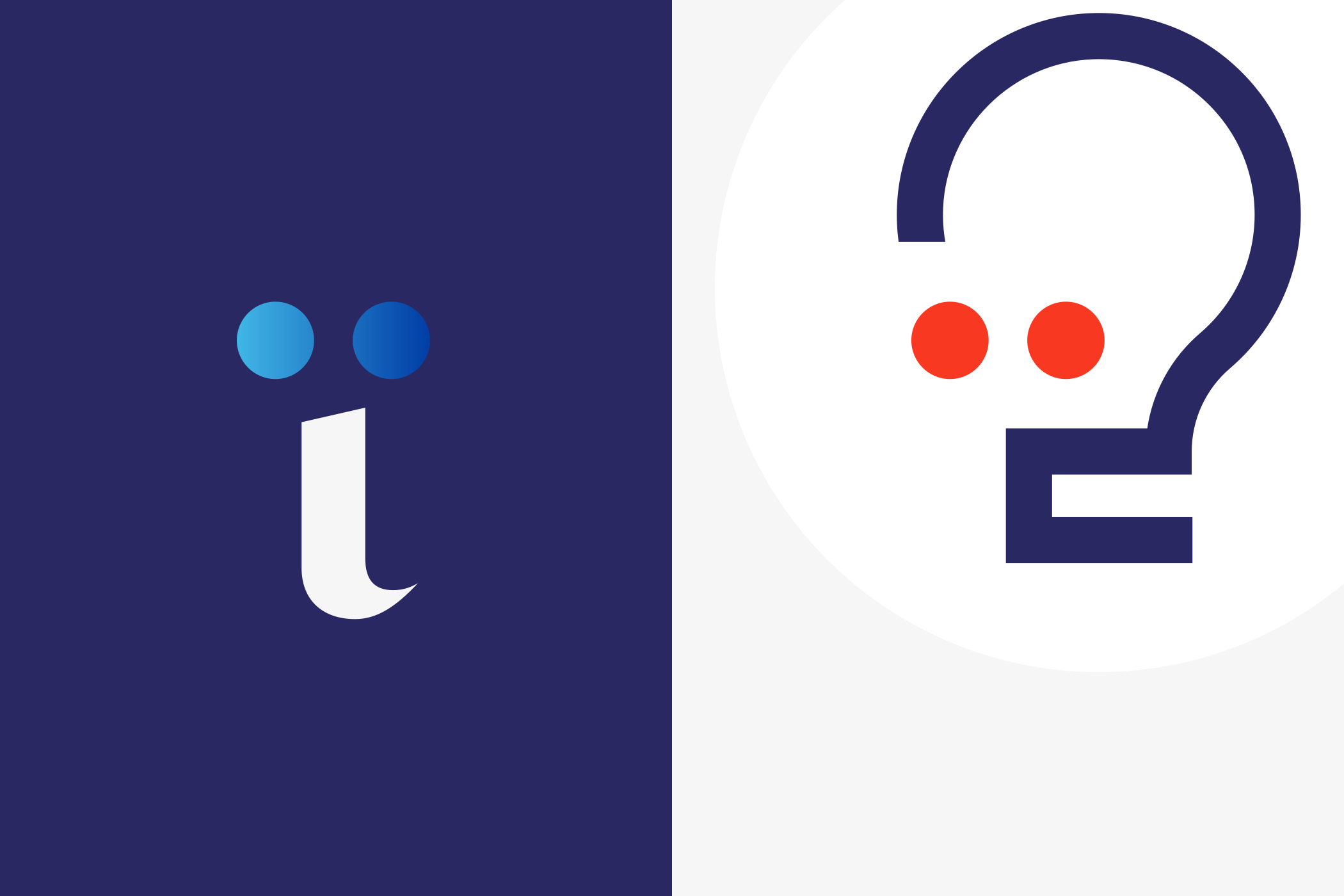
of communication: the face. From this idea emerged the mium
mark—a stylised encounter between people and technology.

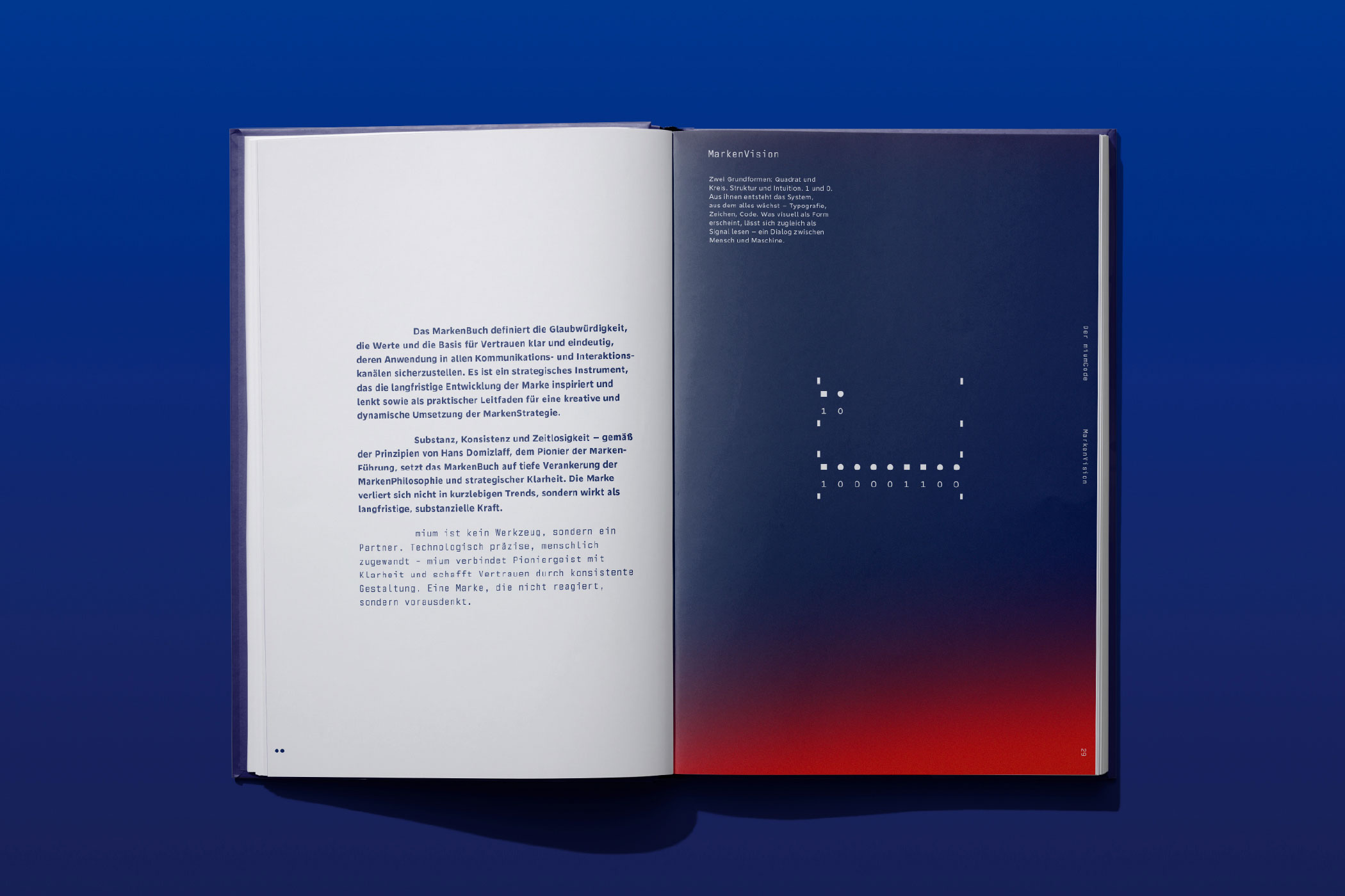
Every brand needs a principle from which it can grow. For mium, two elementary shapes form the foundation of the entire design system.
Square and circle. Structure and intuition. One and zero.
From their interaction emerge the logo, the symbol and the
visual language. What appears to be a simple geometric form
can also be read as a digital signal—a dialogue between
people and technology.
From Idea to Form
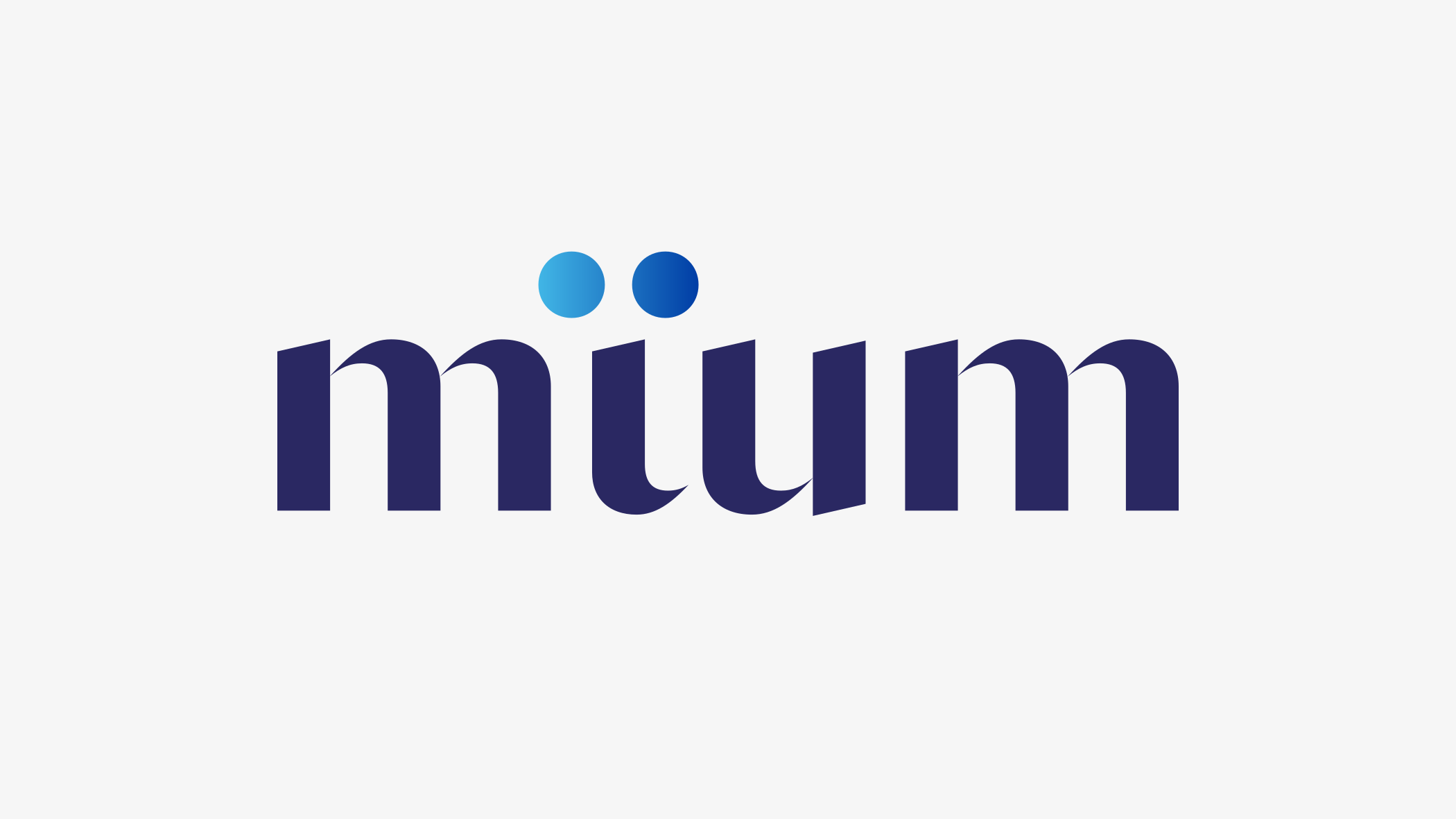
Great logos do not become smaller. They become simpler.
Each stage distils the identity to its essence without
losing recognition, creating a flexible identity system
that works seamlessly from a favicon to large-scale brand
communication.

One Idea, Three Expressions
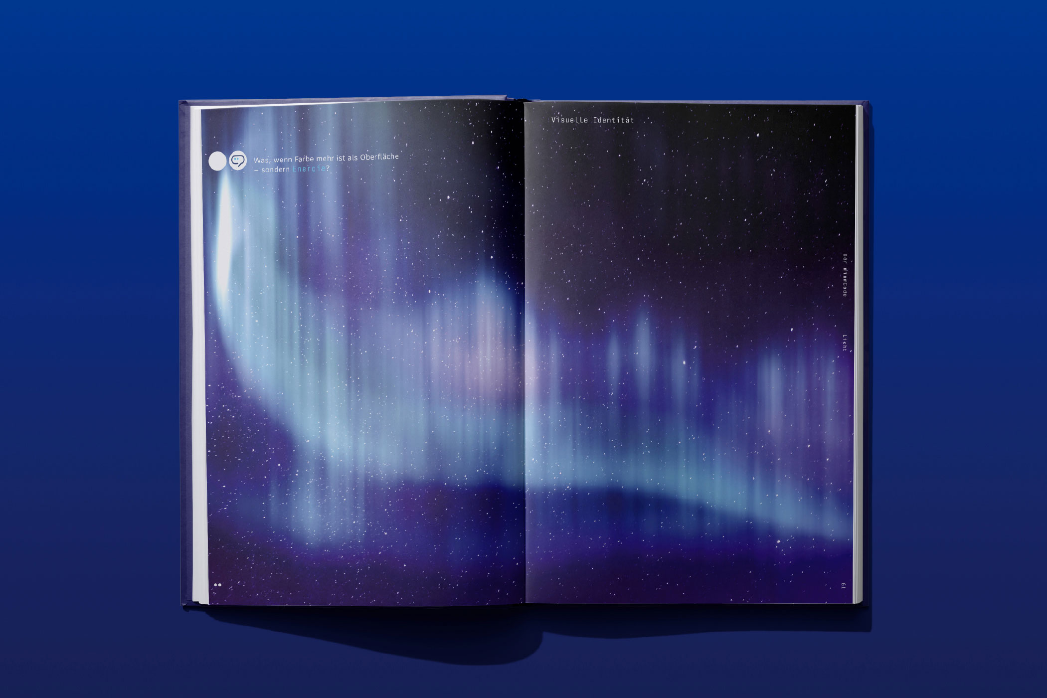
Colour does more than define surfaces. It expresses
energy.
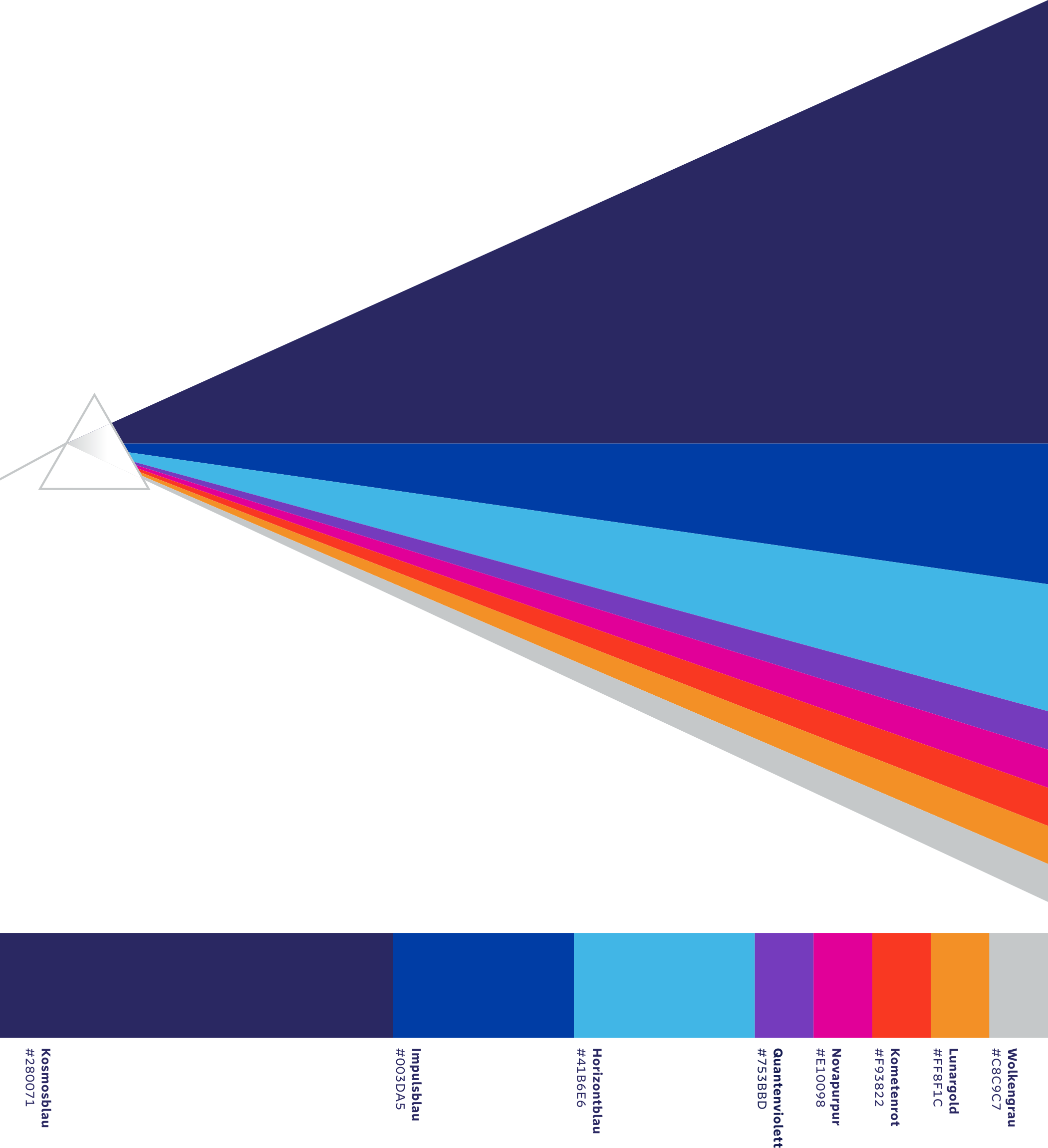
For mium, identity is created not by individual colours but
by the relationship between them. Names such as Kosmosblau,
Nullpunkt Weiß and Quantenviolett are more than colours—they
are part of the brand’s vocabulary, shaping atmosphere as
much as identity. Their proportions follow the Golden Ratio,
creating a visual balance that defines the entire brand
system.
The Aura is more than a gradient. It expresses what defines mium: energy instead of effect, movement instead of decoration. Only through animation does it reveal its full potential, transforming technical precision into an inspiring visual rhythm.
A strong brand is recognised not only by its logo, but also through the smallest elements of its visual language. mium’s icons and symbols were developed from the same design principle as the logo itself. The brand mark reappears as a recurring motif, giving even abstract symbols a subtle sense of personality.
Two dots become a glance. A glance becomes a connection.
Icons provide orientation. Symbols translate complex ideas
into distinctive visual metaphors. Together they create a
visual language that does more than explain—it communicates
character.
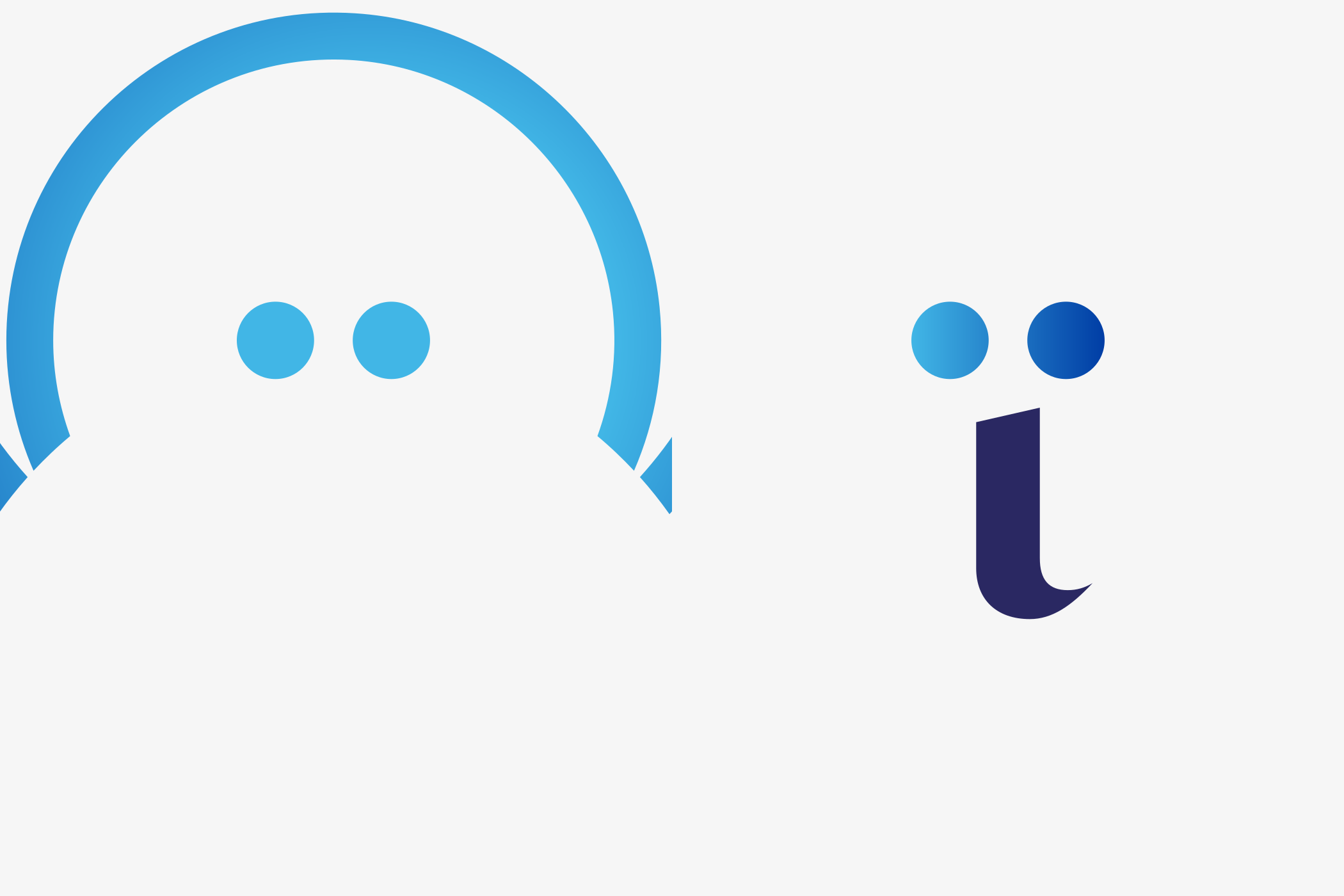
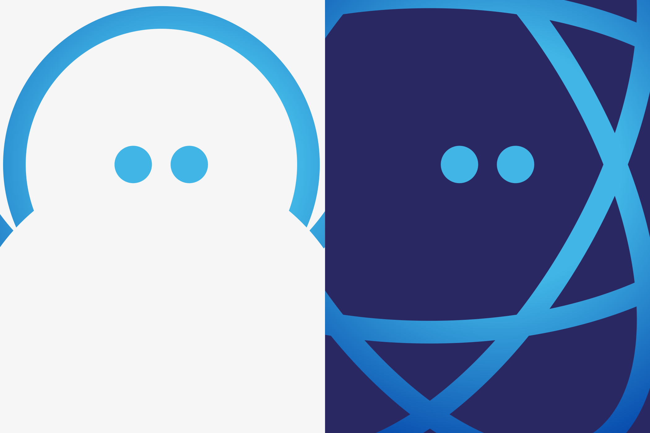
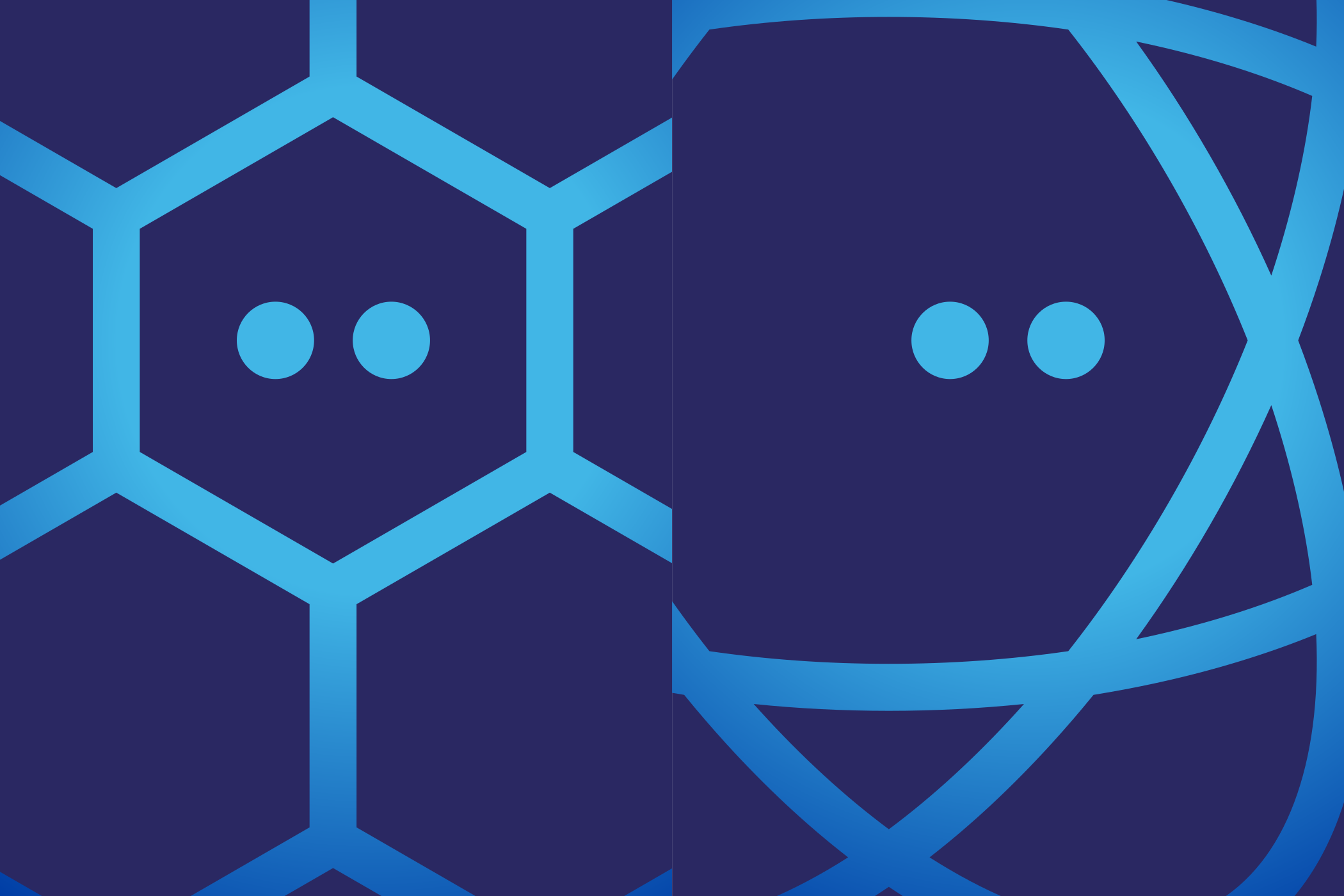
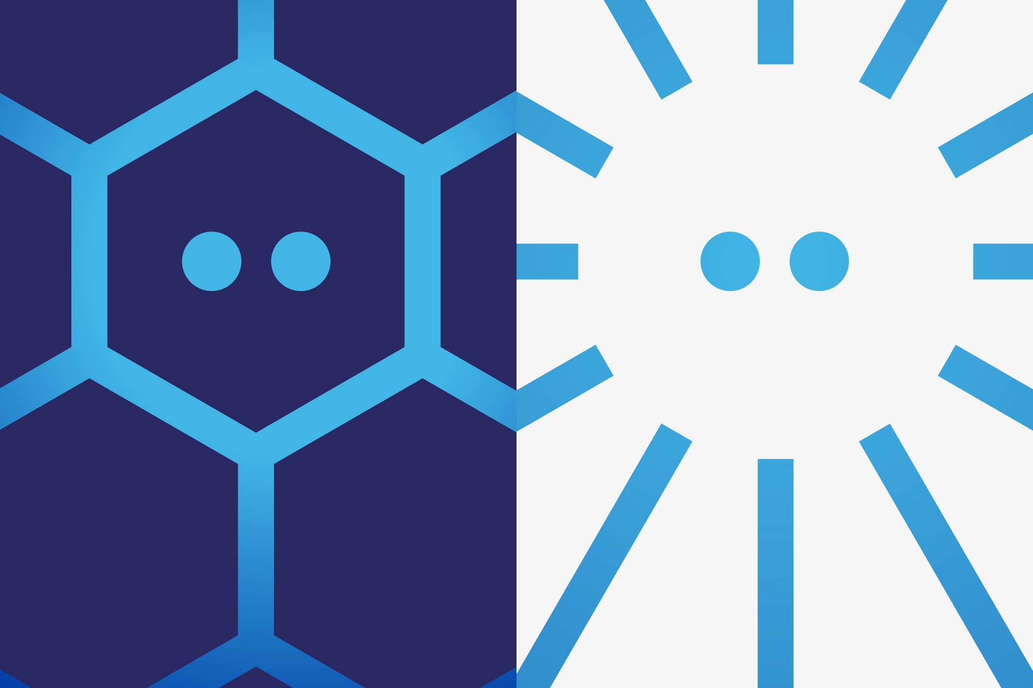
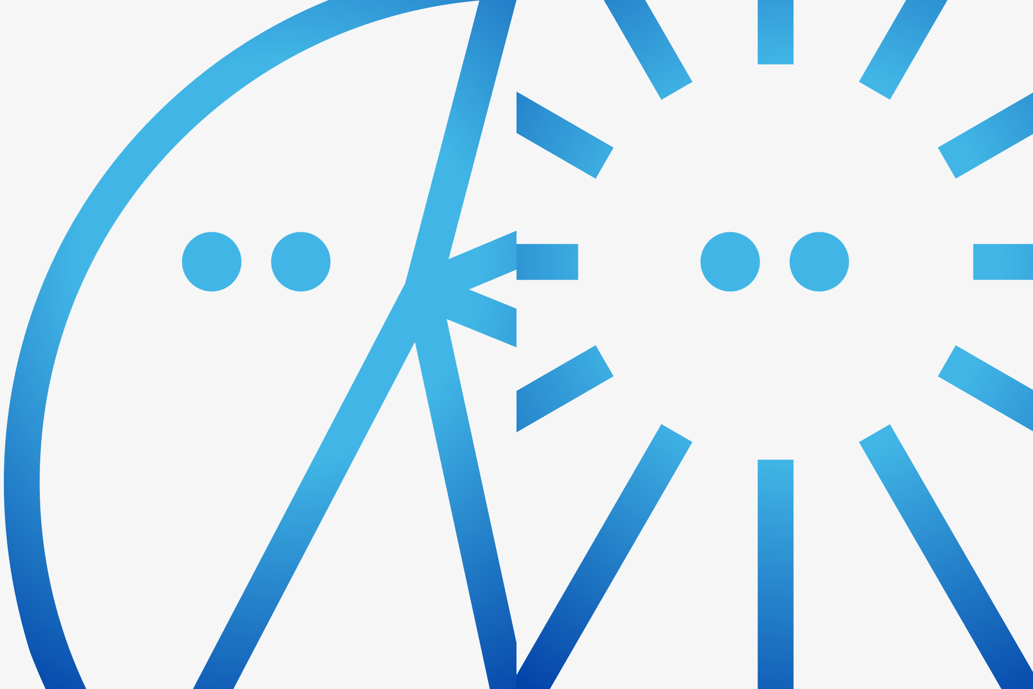
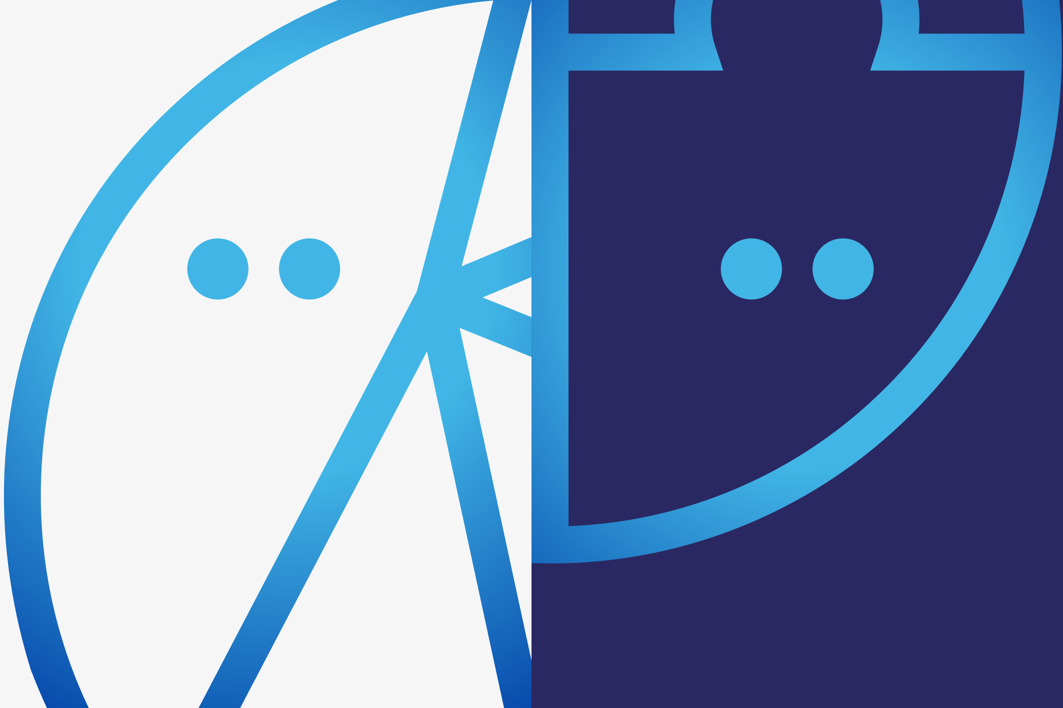
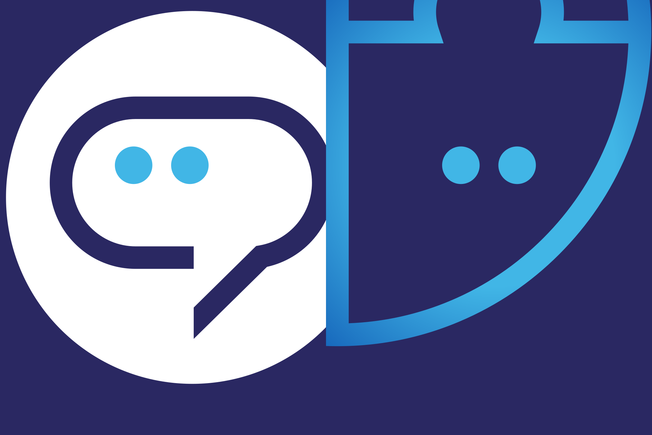
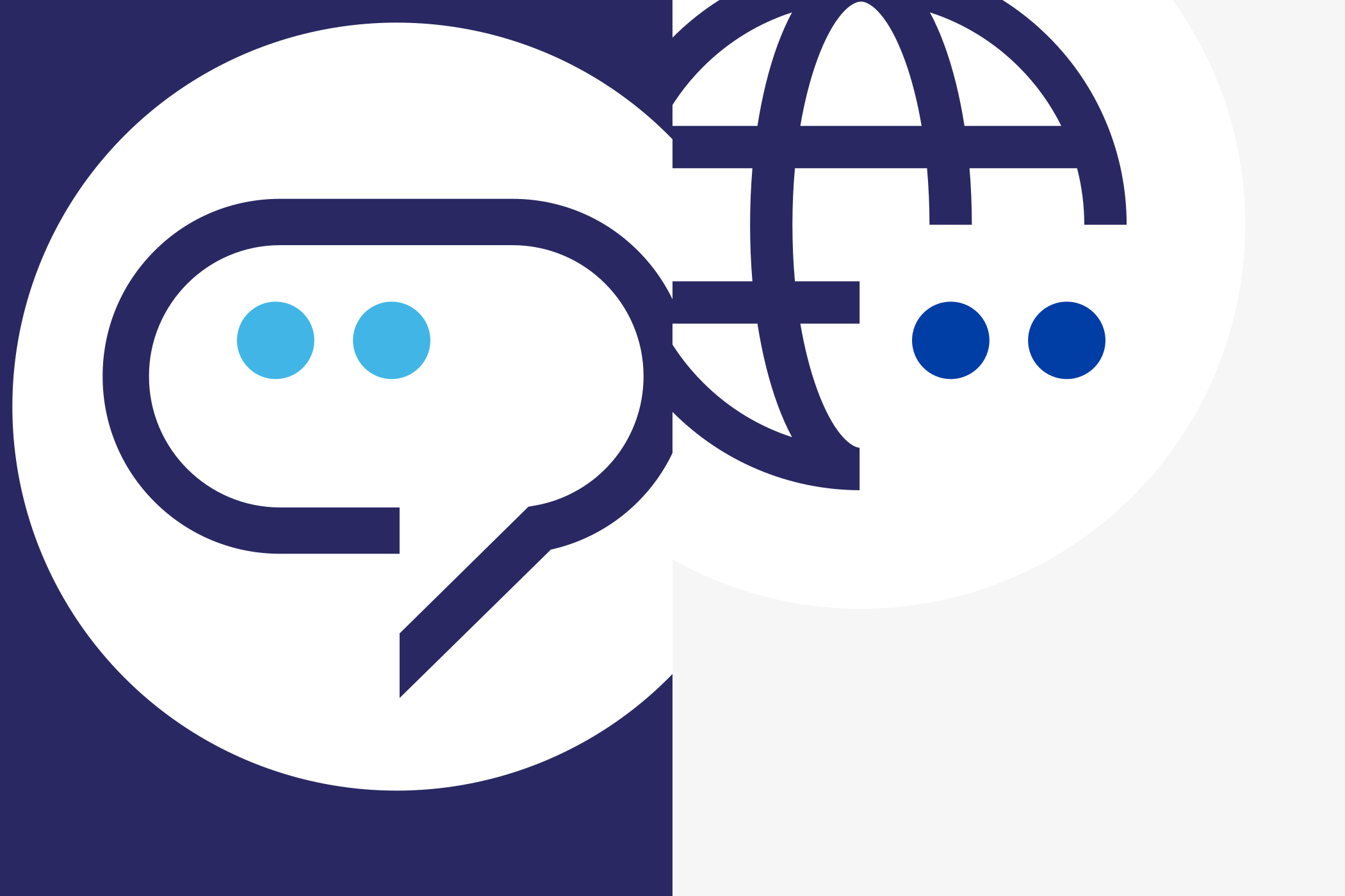
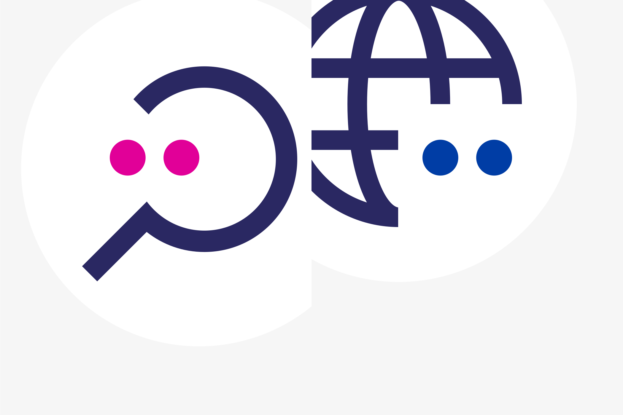

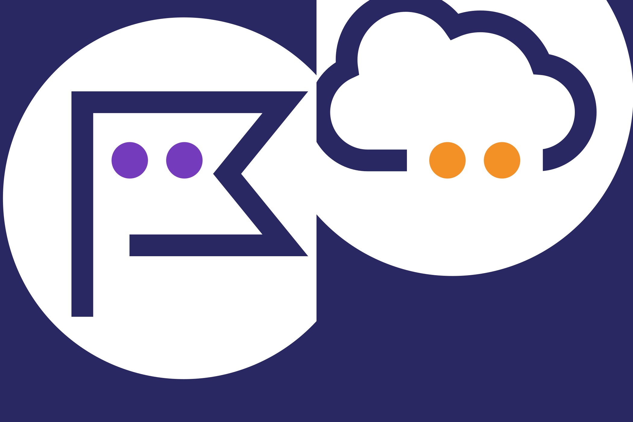
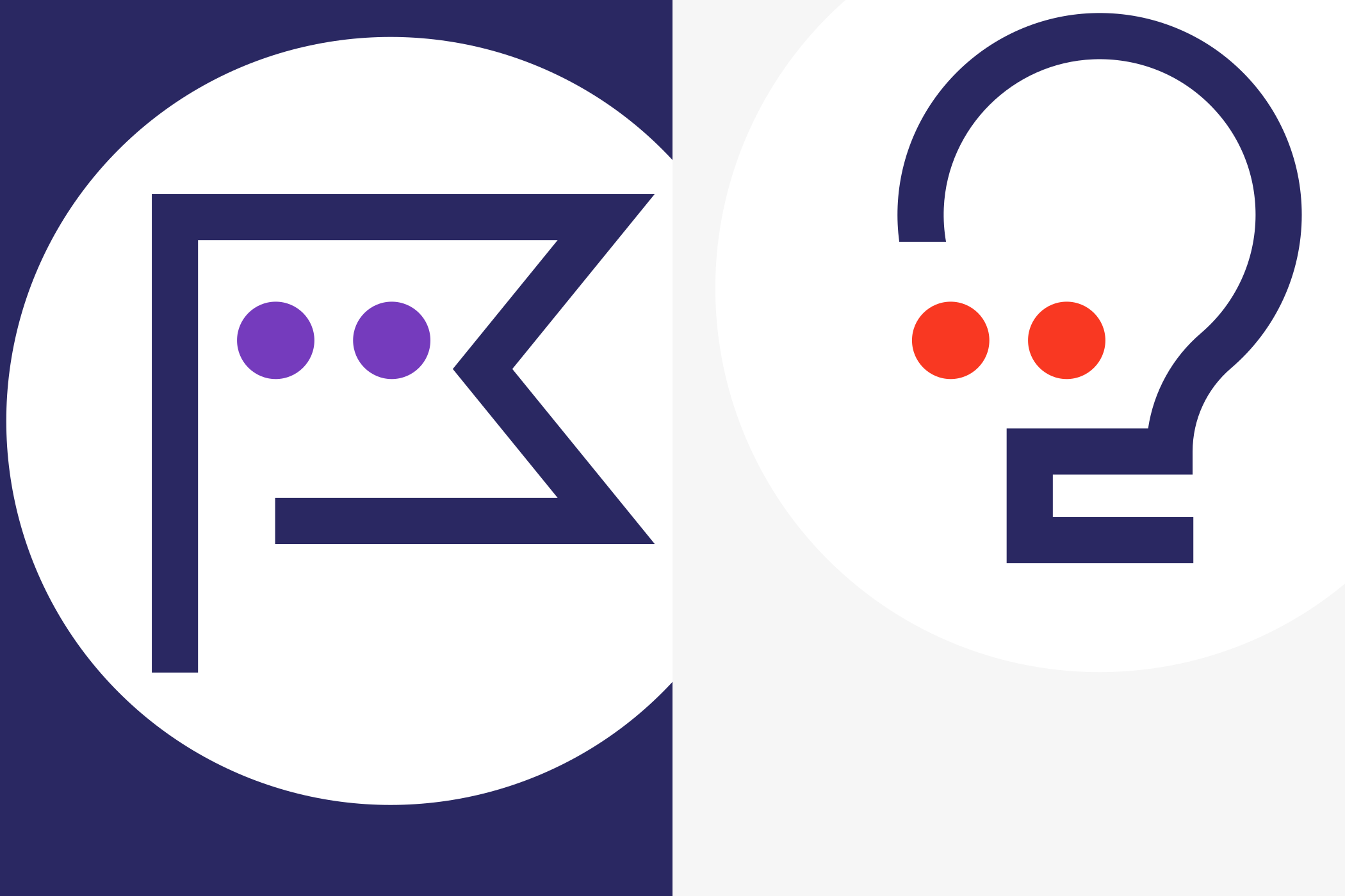
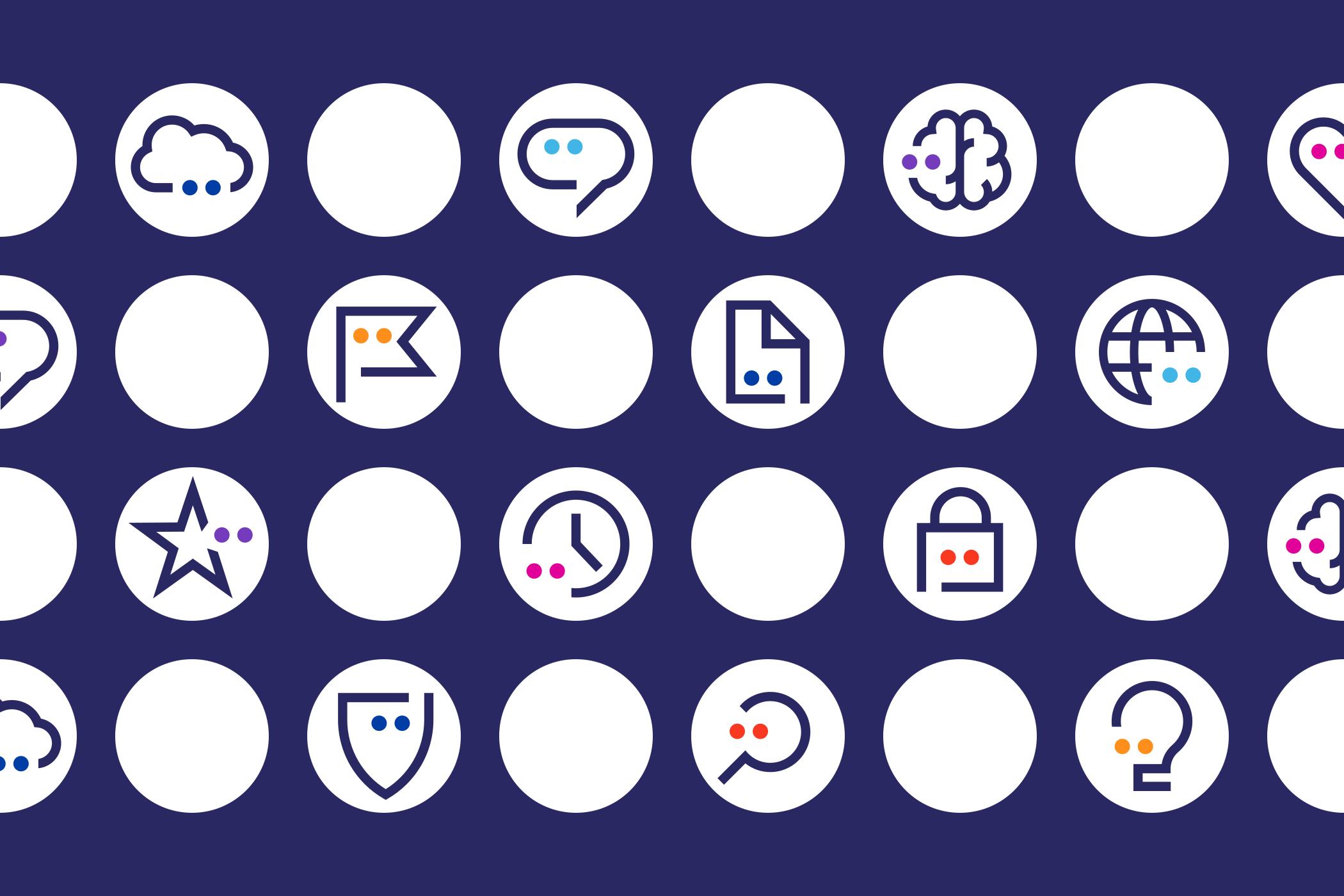
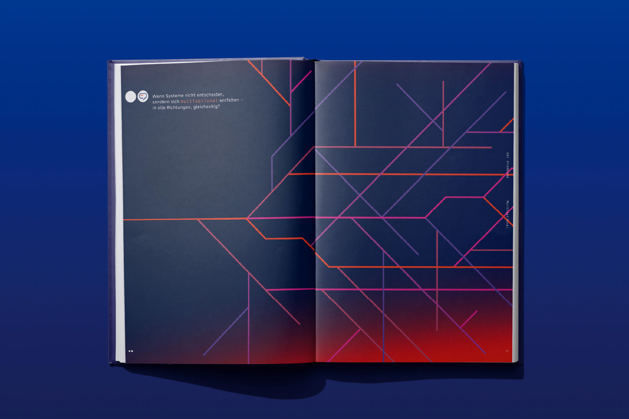
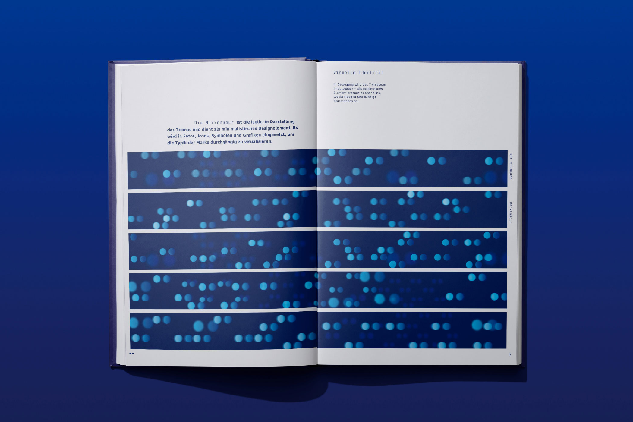
Complex ideas require clarity. Using the same visual language, a system of abstract diagrams was developed to communicate principles rather than products or features. Minimal forms and deliberate colour relationships transform complexity into understanding.
Rather than relying on familiar imagery such as circuit
boards or neural networks, mium developed its own visual
language. Inspired by the aesthetics of early technical
drawings, animated vectors create rhythm, direction and
flow.
Animation is not an effect. It is part of the design
system.
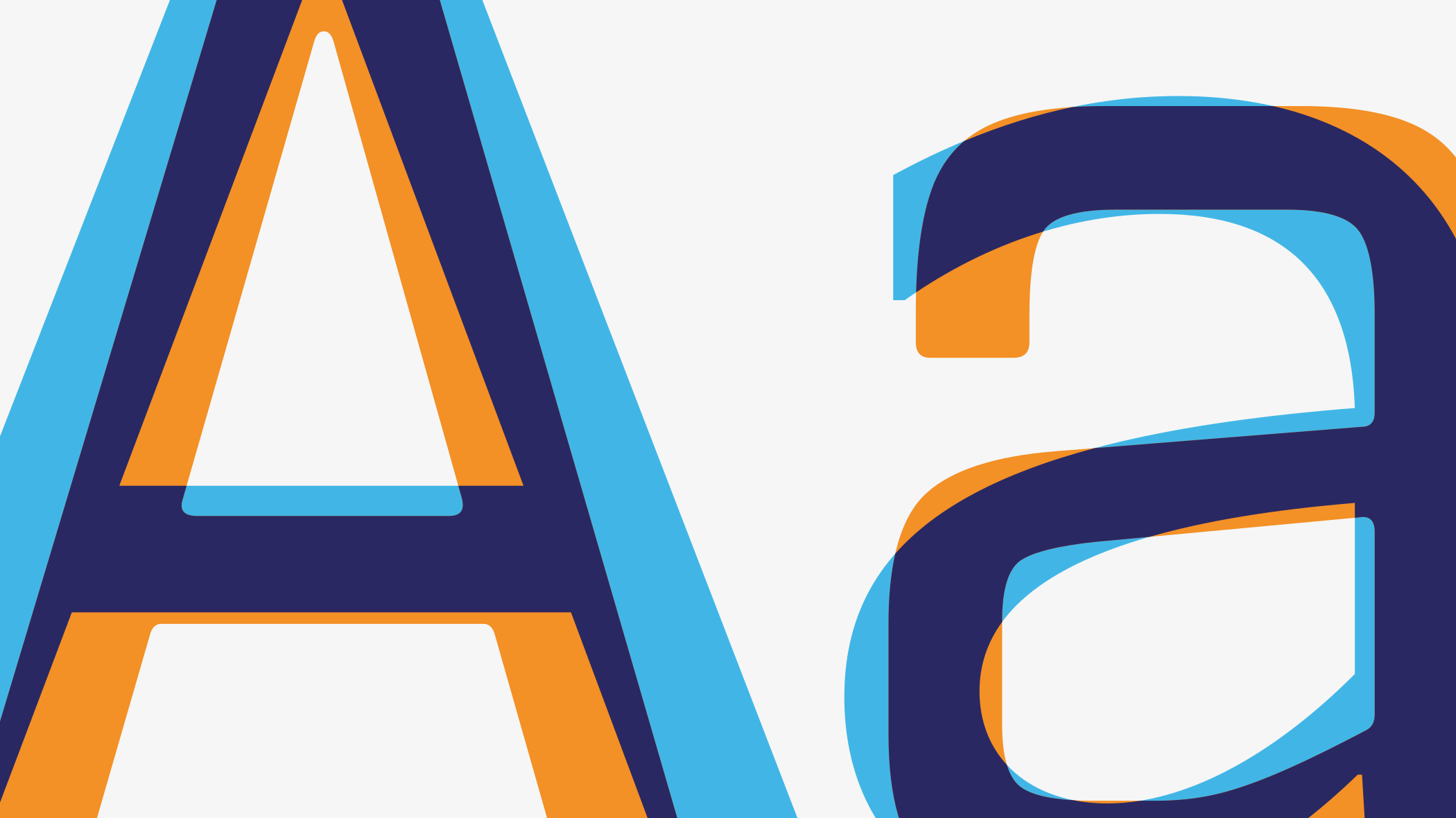
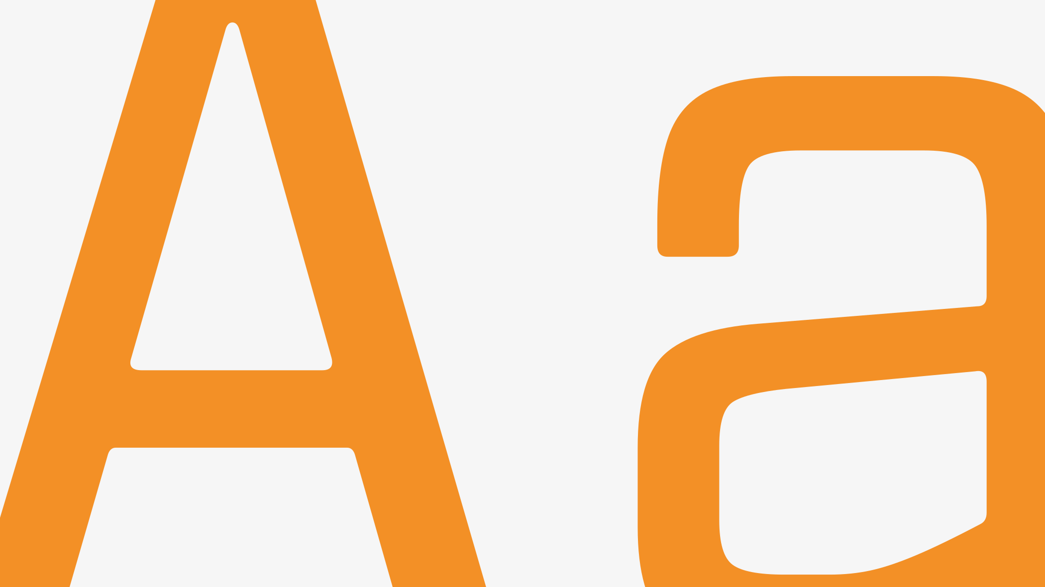
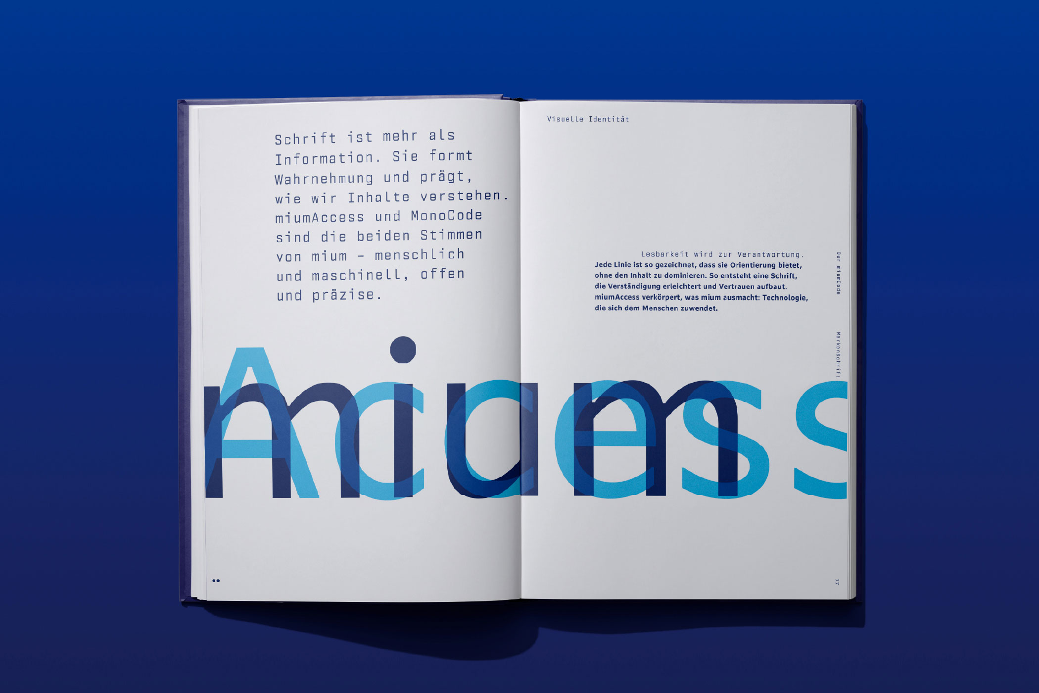
miumAccess speaks to people. Open, approachable and designed for maximum readability. MonoCode speaks to systems. Precise, structured and rhythmically consistent. Together they form the typographic foundation of the brand.
Explore the case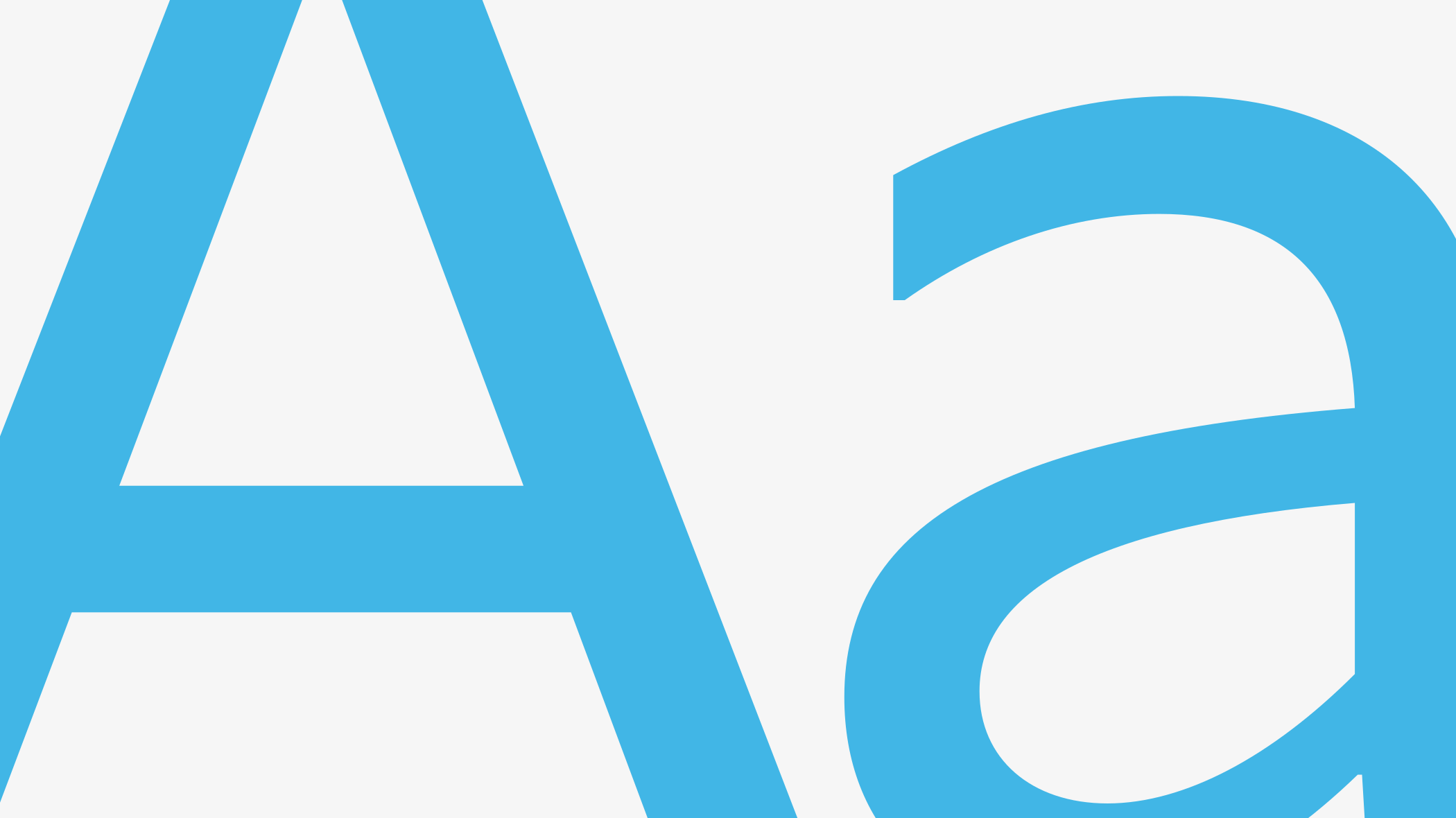
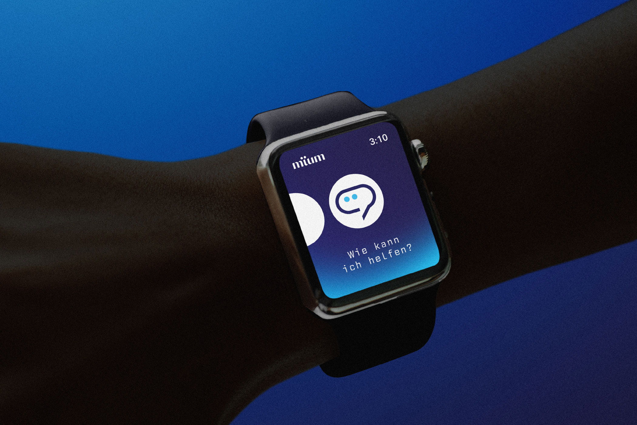
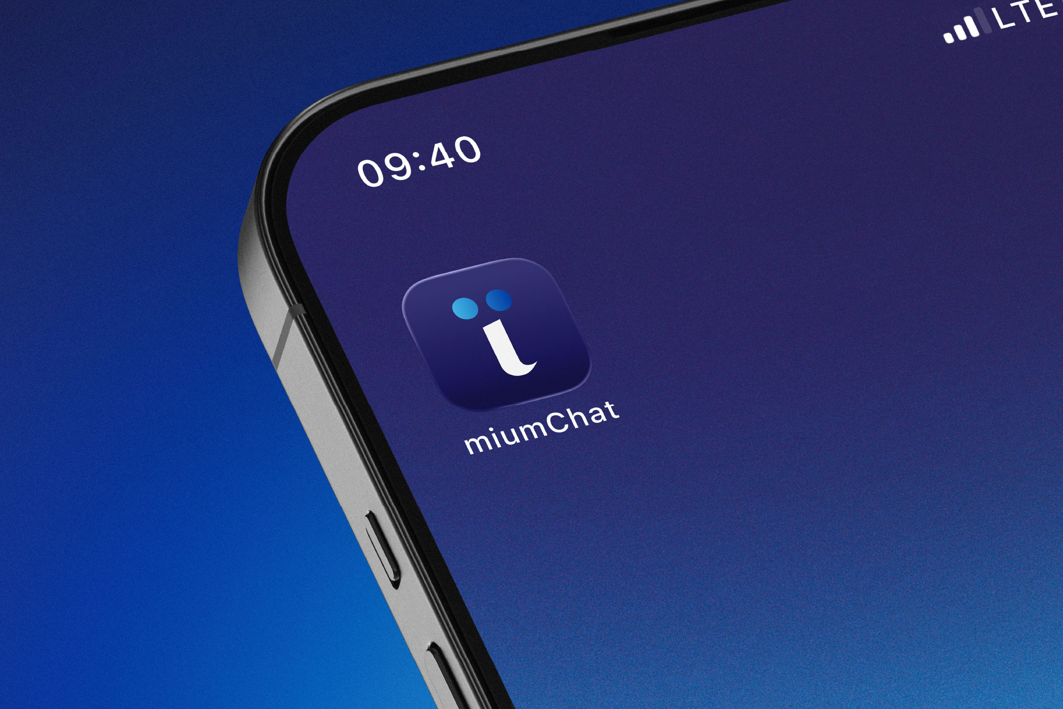
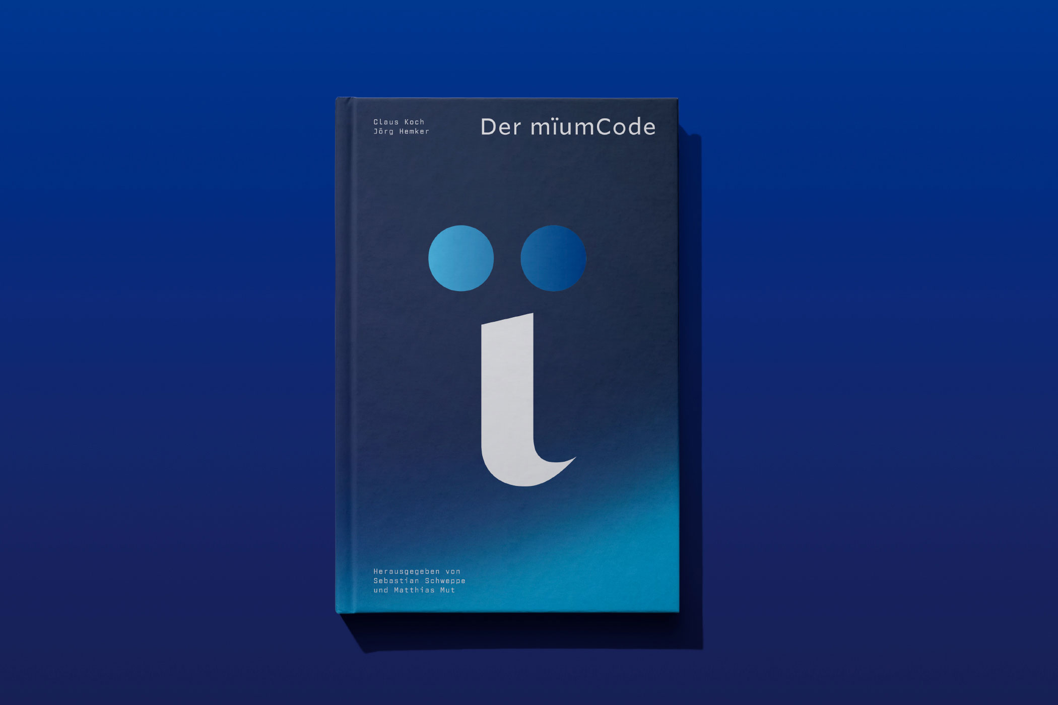
A design system reveals its true strength through
application.
Across social media, digital products, publications and
brand communication, every element belongs to the same
visual language. Not because it follows a set of rules, but
because it grows from the same underlying idea.
Landing Page



Applications
Social Media
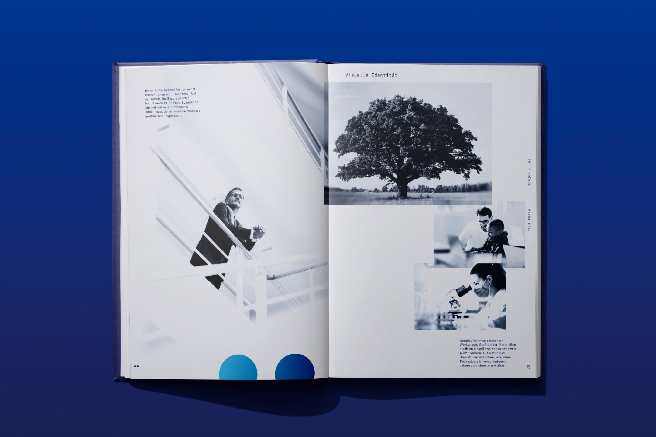
Visual Impulse
Brand Book
Brand Strategy, Brand Identity by Claus Koch™