
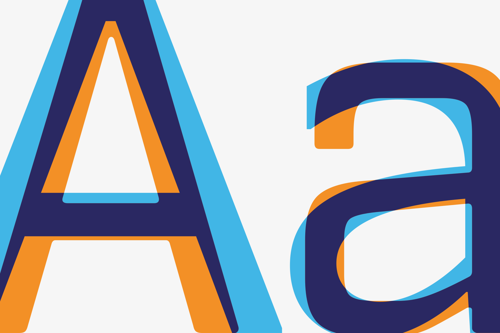
Type Design for mium
Every brand needs a voice before it can be heard. For mium, that meant creating two complementary typefaces for the relationship between people and technology.
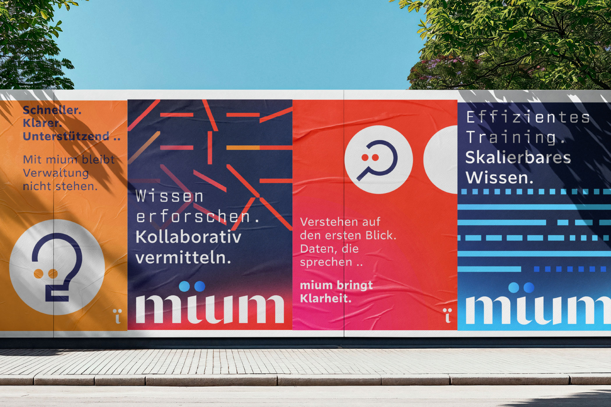
People seek clarity, empathy and trust. Technology relies on precision, logic and structure. Together, miumAccess and MonoCode translate Inspirierende Intelligenz into readable form, creating a typographic system where both voices coexist. A human-centred approach in which technology adapts to people—not the other way around.
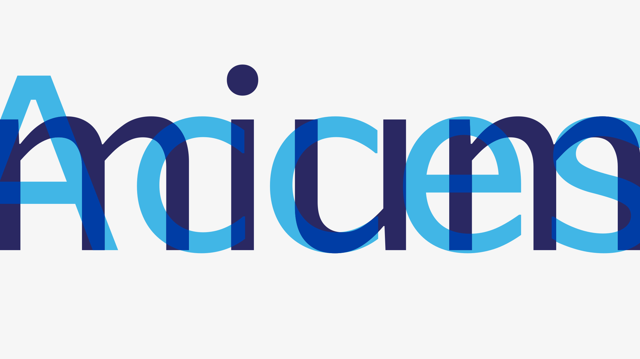
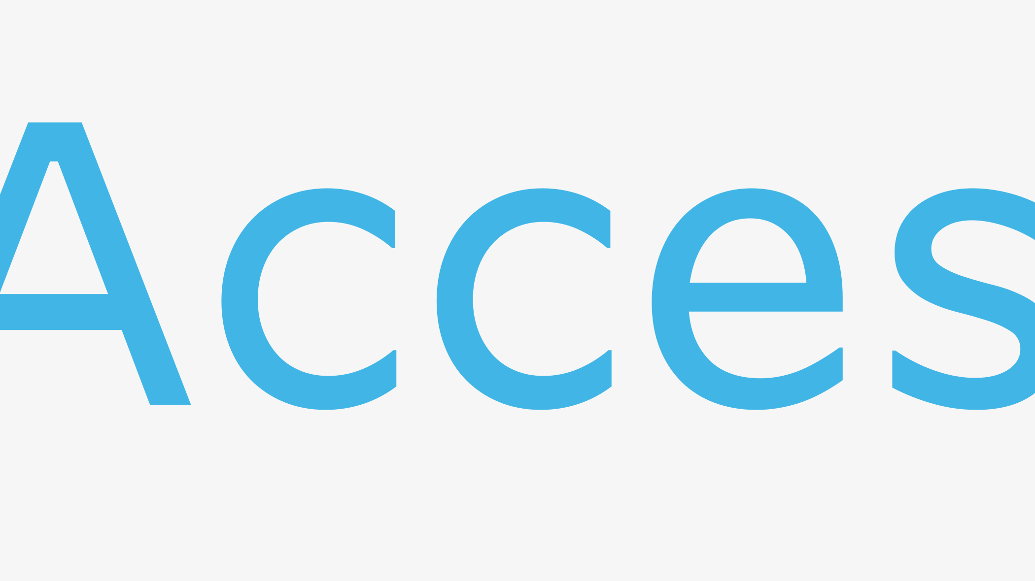
Reading is never neutral.
Every line shapes the way information is
perceived, understood and trusted. Rather than
maximising personality, miumAccess was designed
to remove barriers between people and
information.
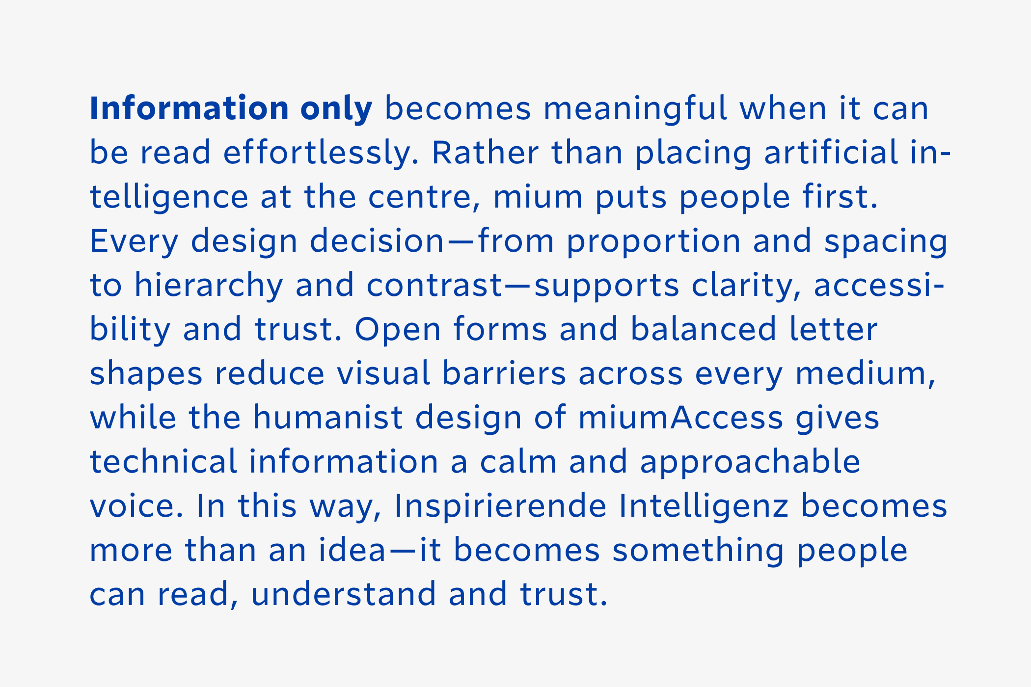
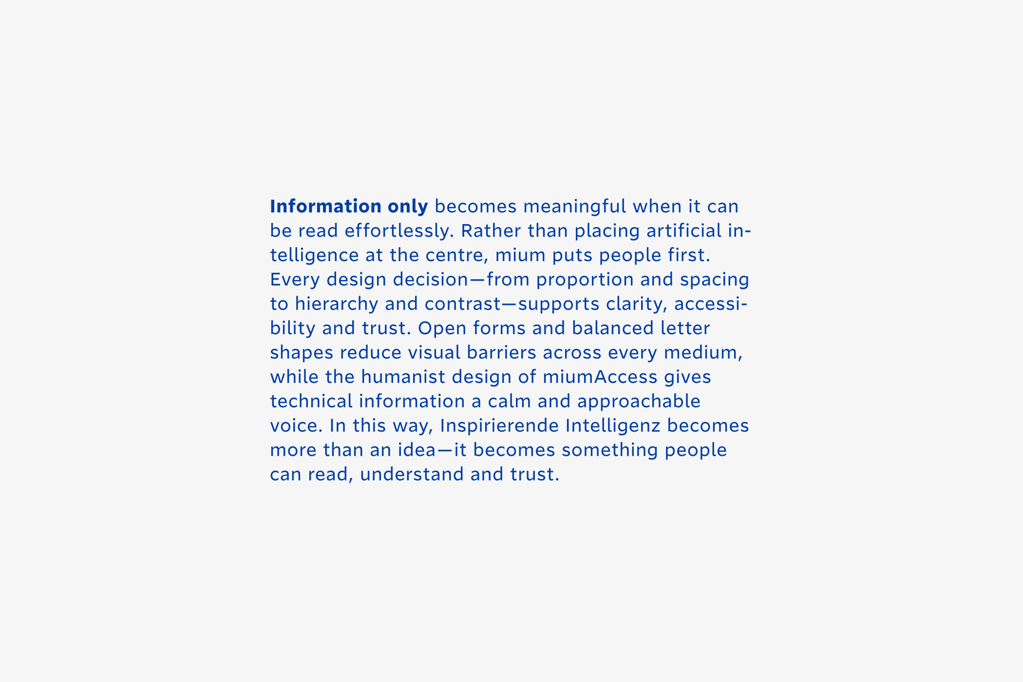
A humanist approach translates the brand idea into form, creating a typeface that feels approachable without compromising precision. Readability is no longer just a technical requirement—it becomes the typographic expression of Inspirierende Intelligenz.
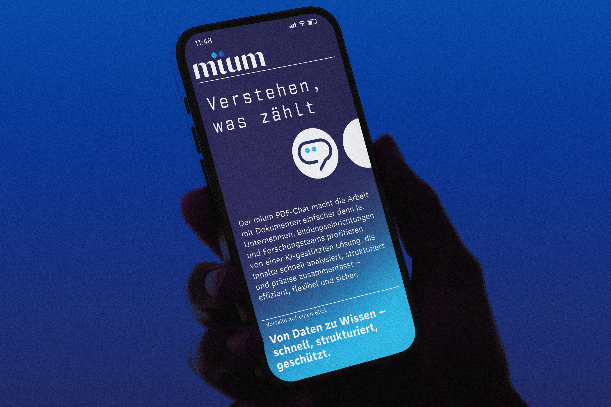
Form is never neutral.
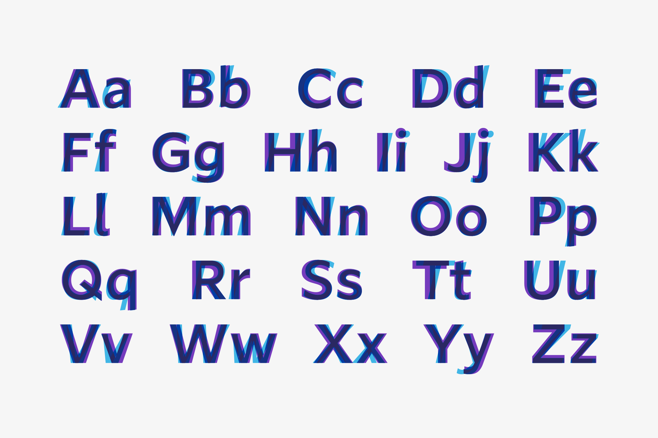
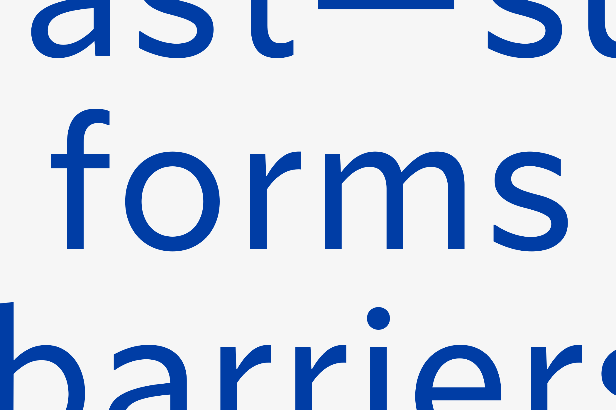
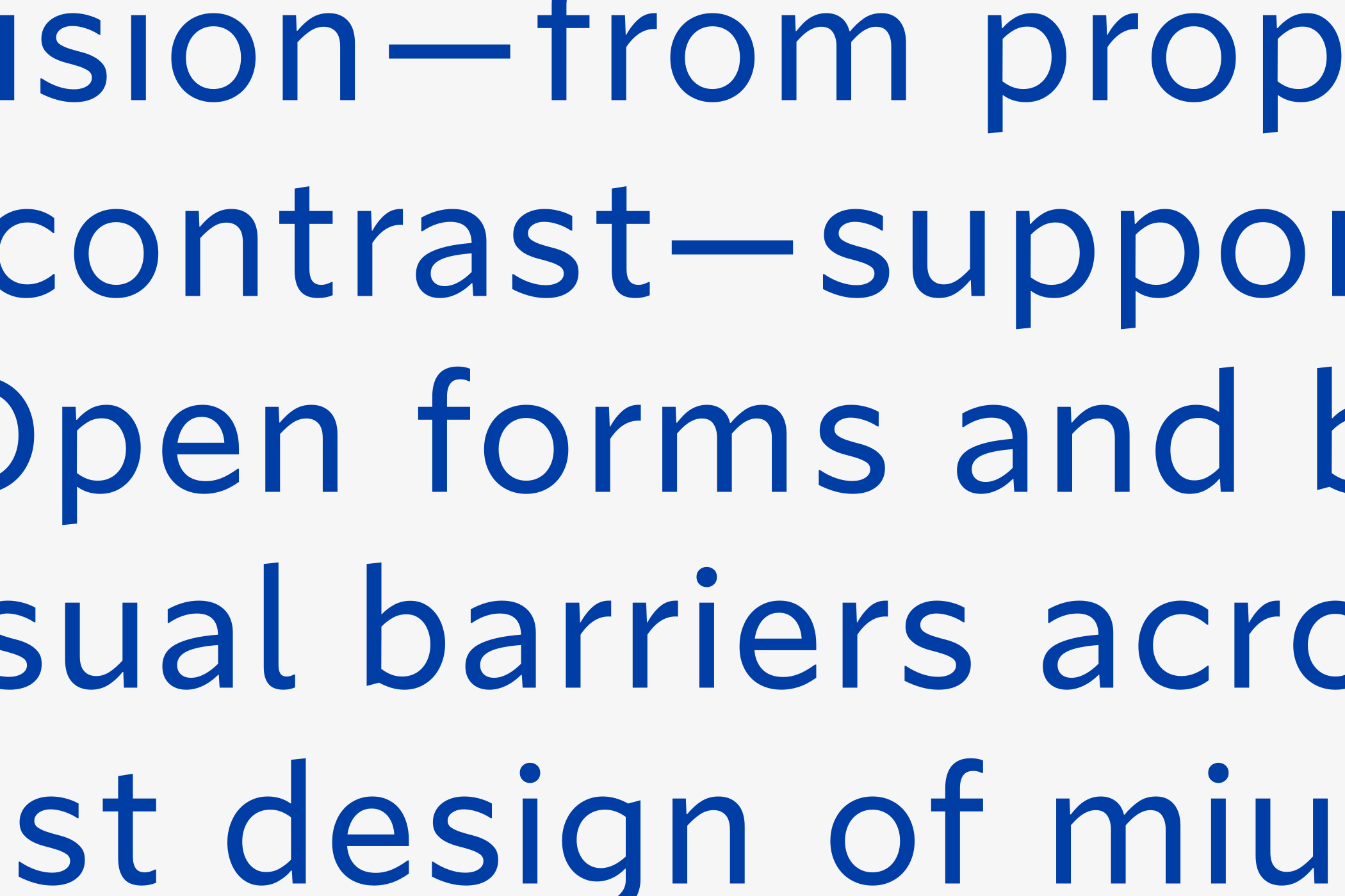
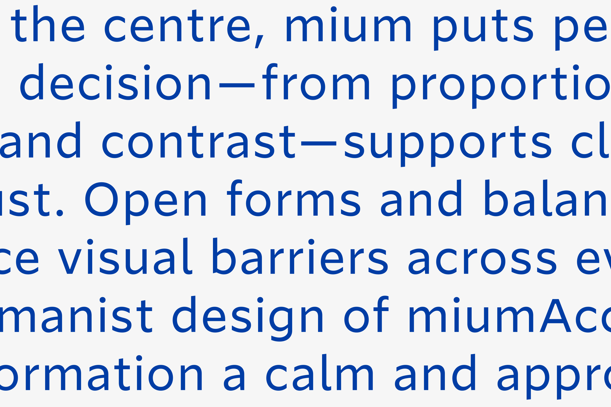
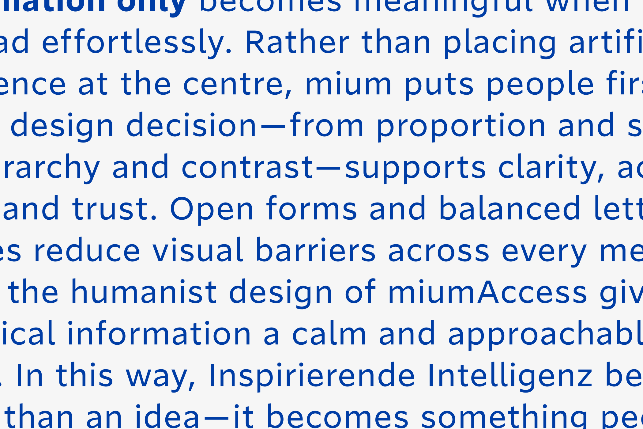
Open forms, generous counters and clearly
distinguishable characters create clarity
without calling attention to themselves.
Carefully balanced stroke contrast supports
readability across different sizes and media,
while Regular, Italic and Bold establish a clear
hierarchy without losing their shared identity.
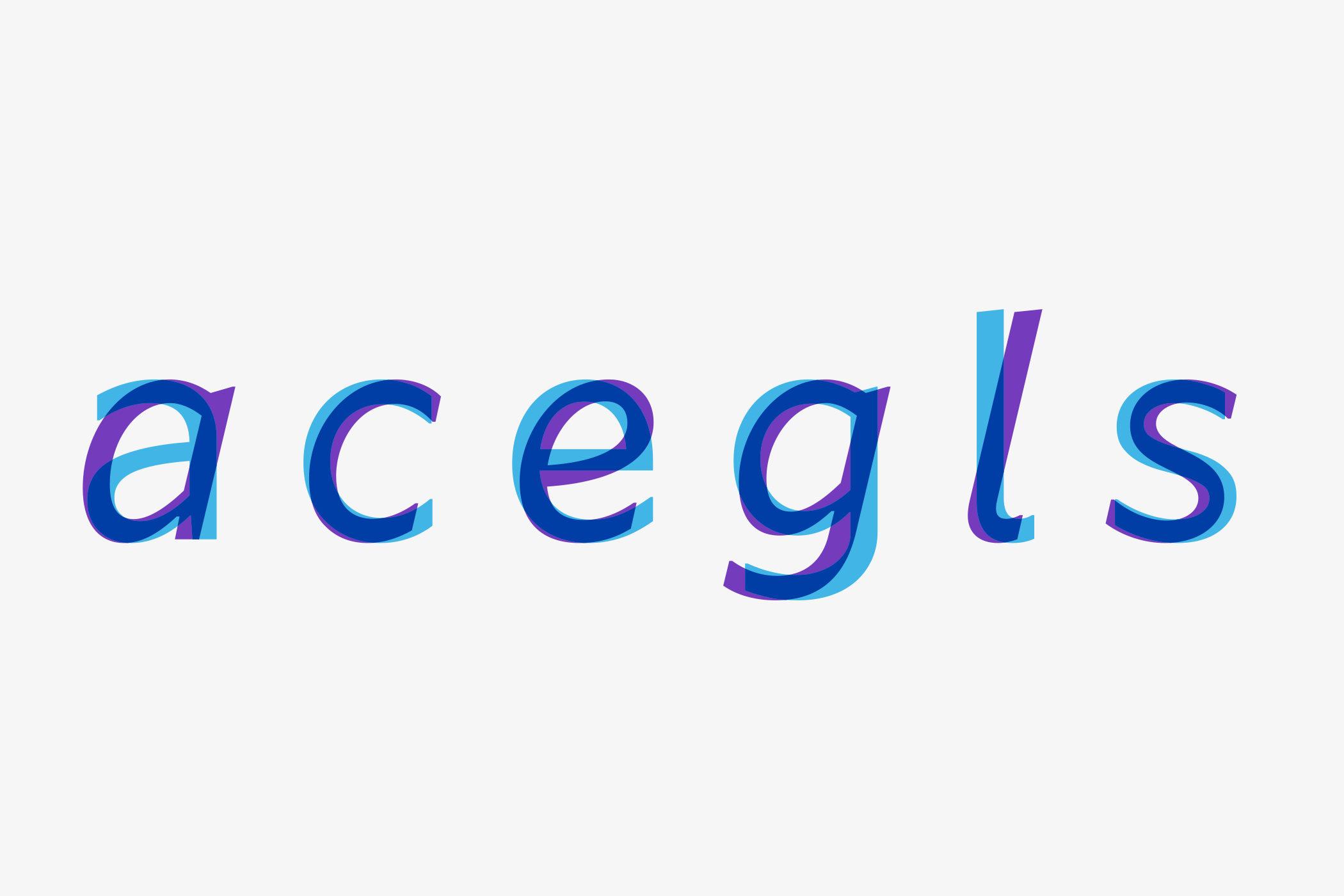
Even the Italic is drawn as a true companion
rather than a mechanically slanted roman,
preserving emphasis and the natural rhythm of
reading.




People are not the only audience a typeface
can speak to.
While miumAccess removes barriers for people,
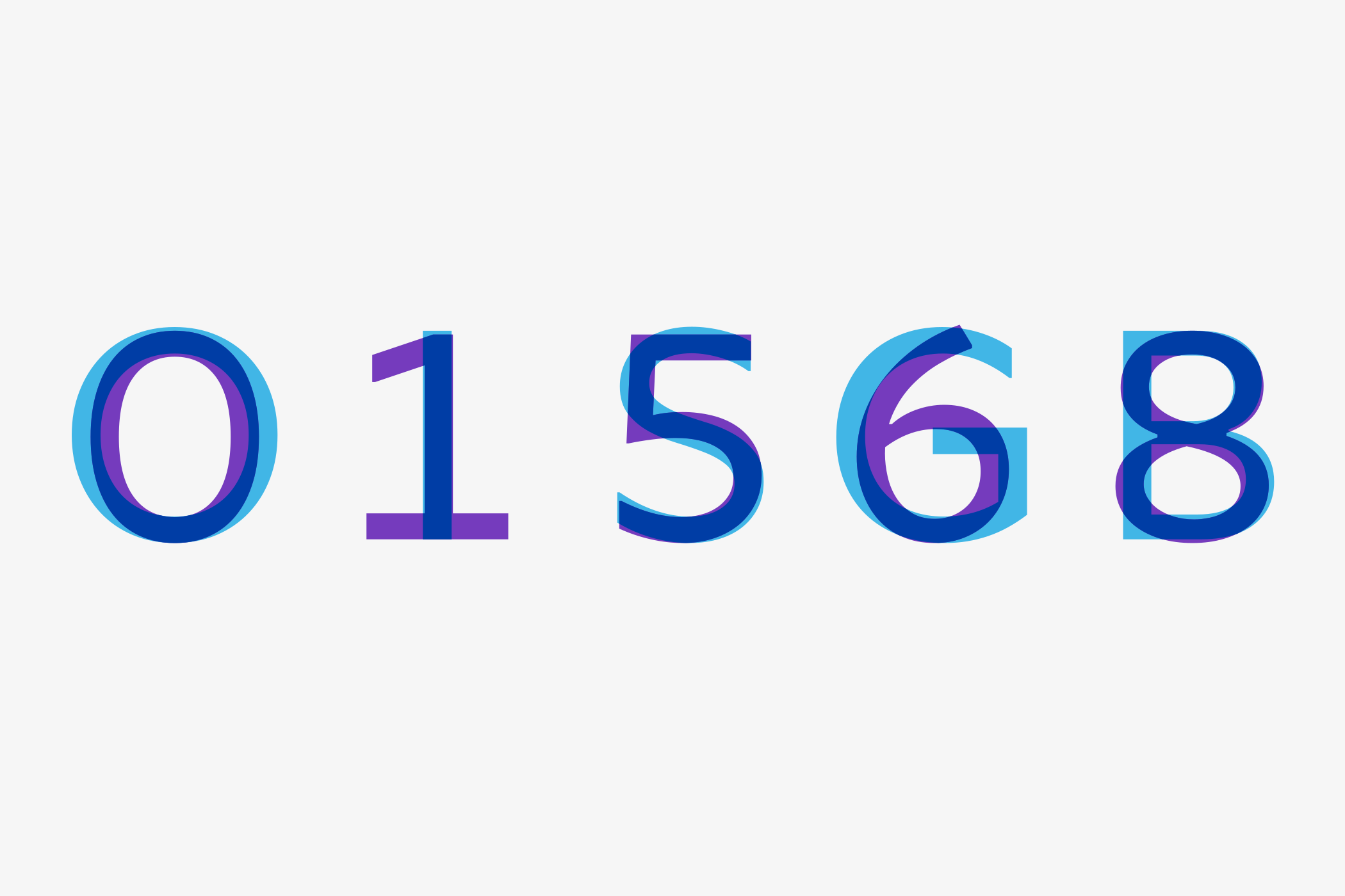
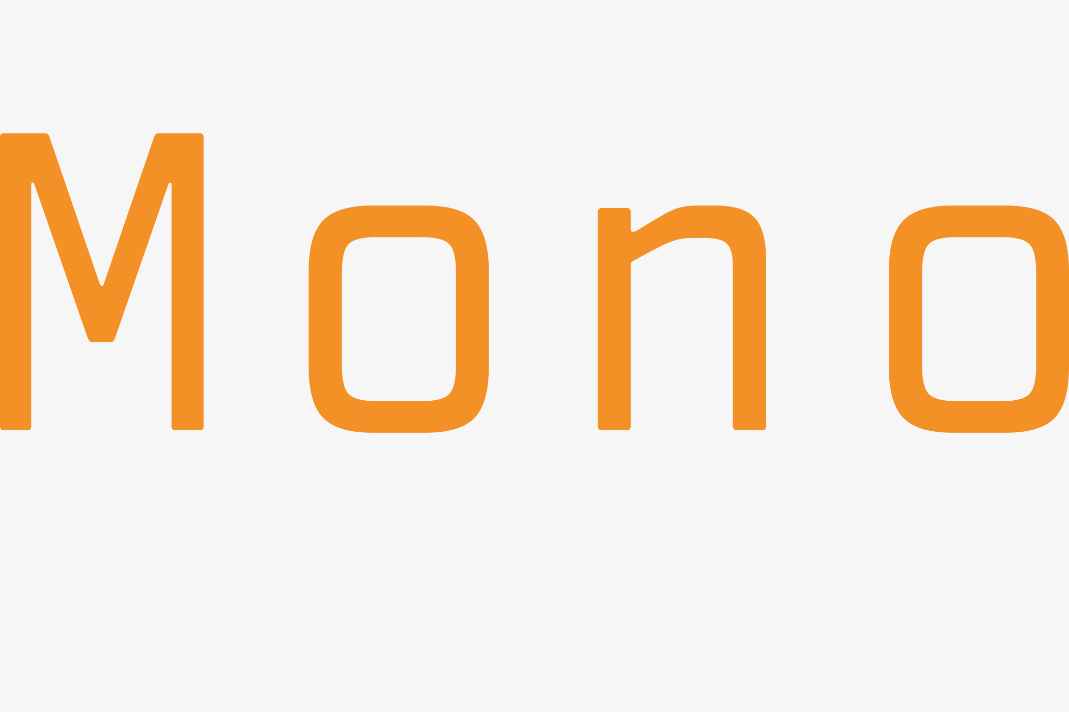
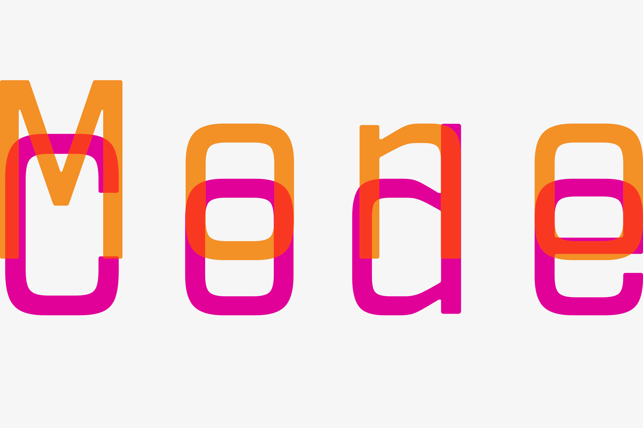
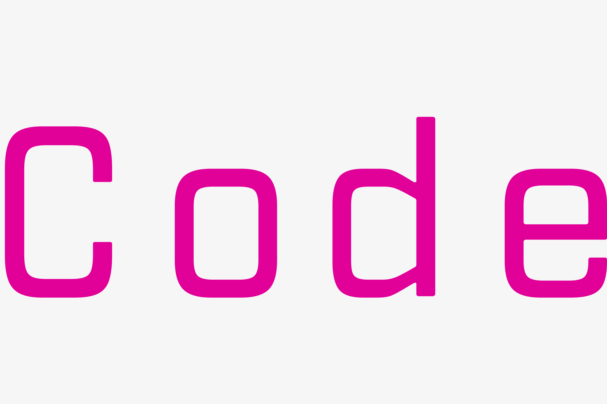
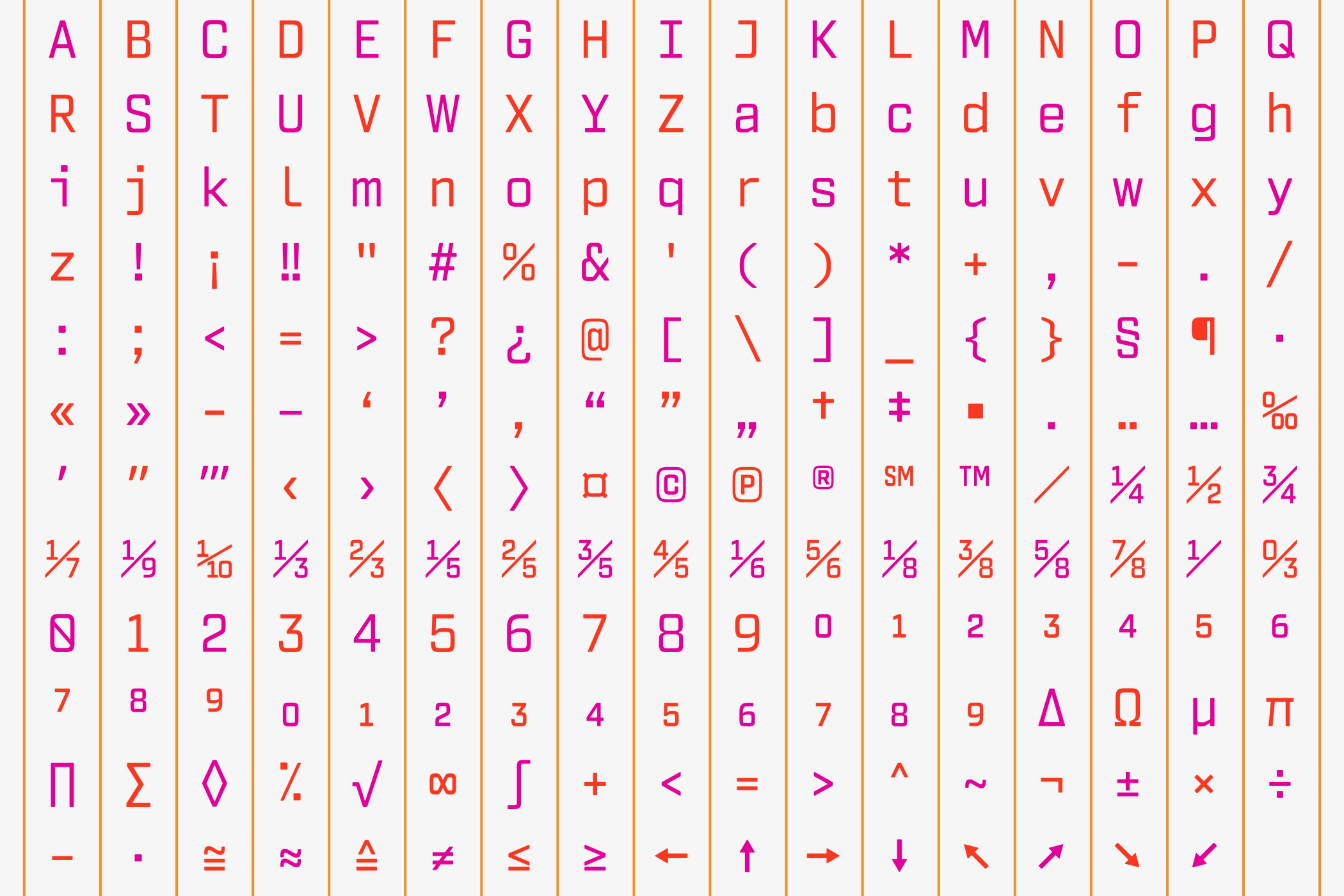
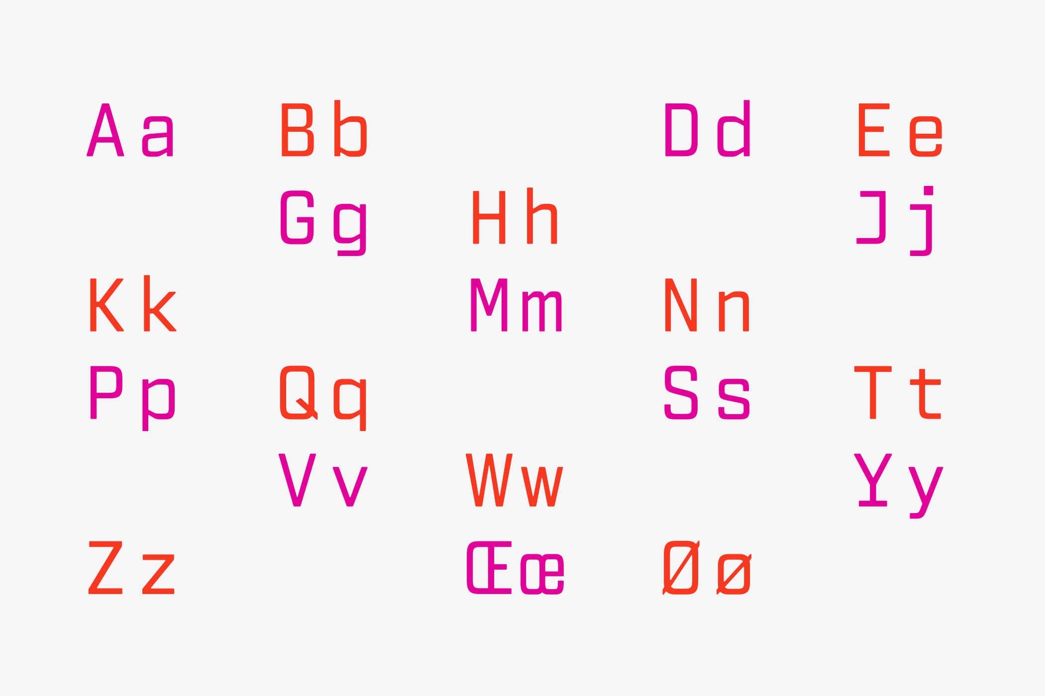
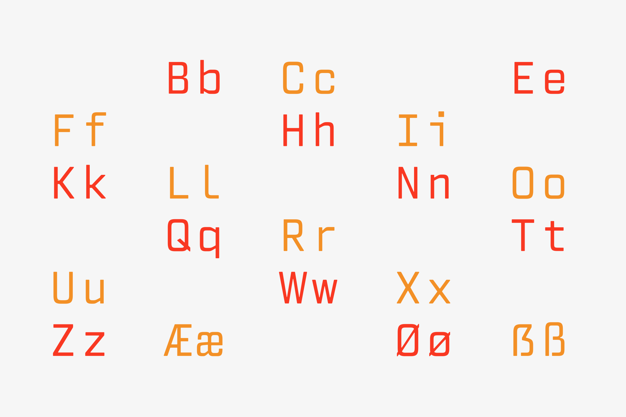
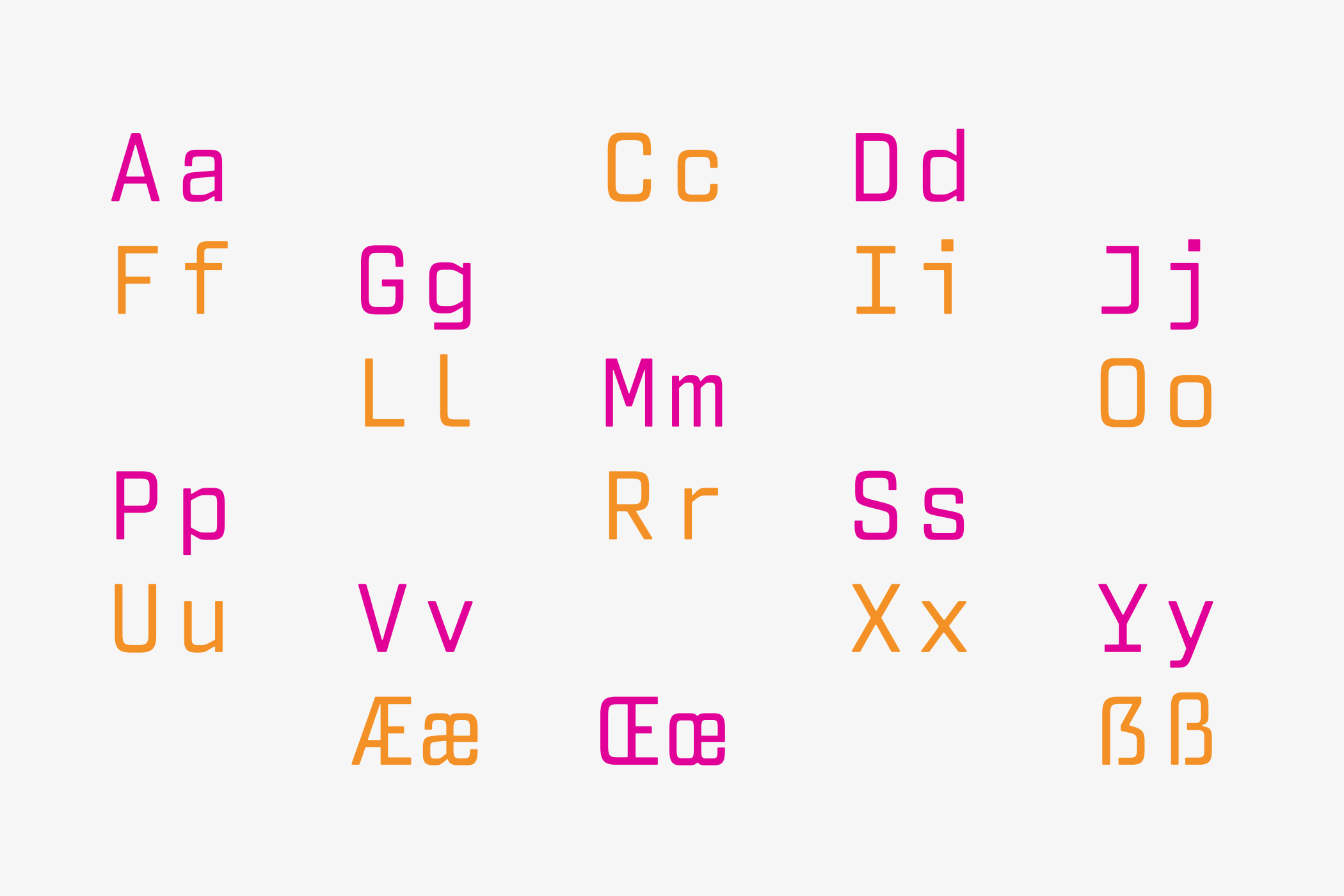
MonoCode brings structure to complexity. Its
monospaced construction gives code, data and
technical information a consistent rhythm,
making systems easier to read, compare and
understand.
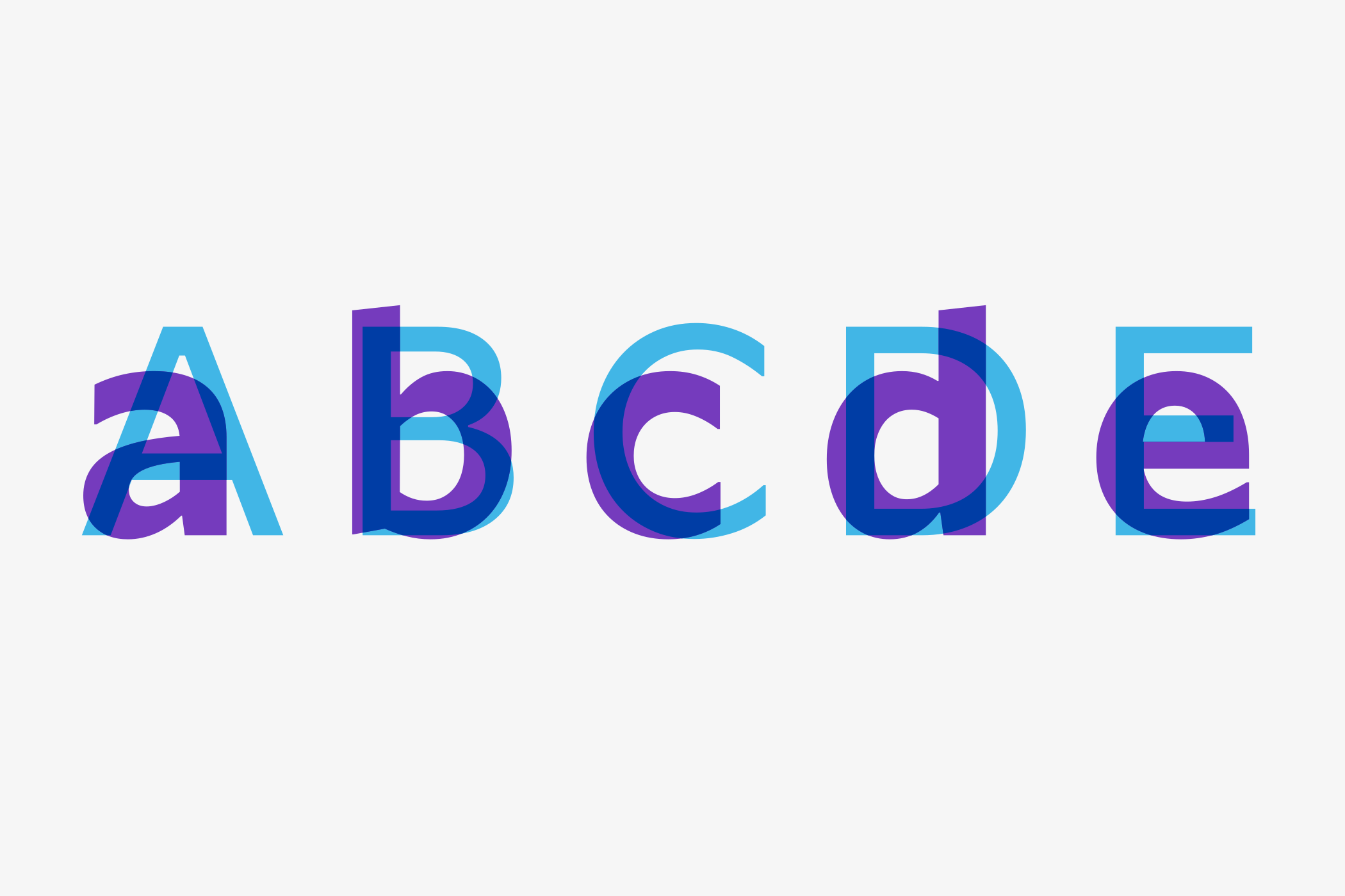
These two voices are not opposites. They complete one another. One creates connection. The other creates order. Together they express the central idea behind Inspirierende Intelligenz: technology that remains technically precise while becoming genuinely human.

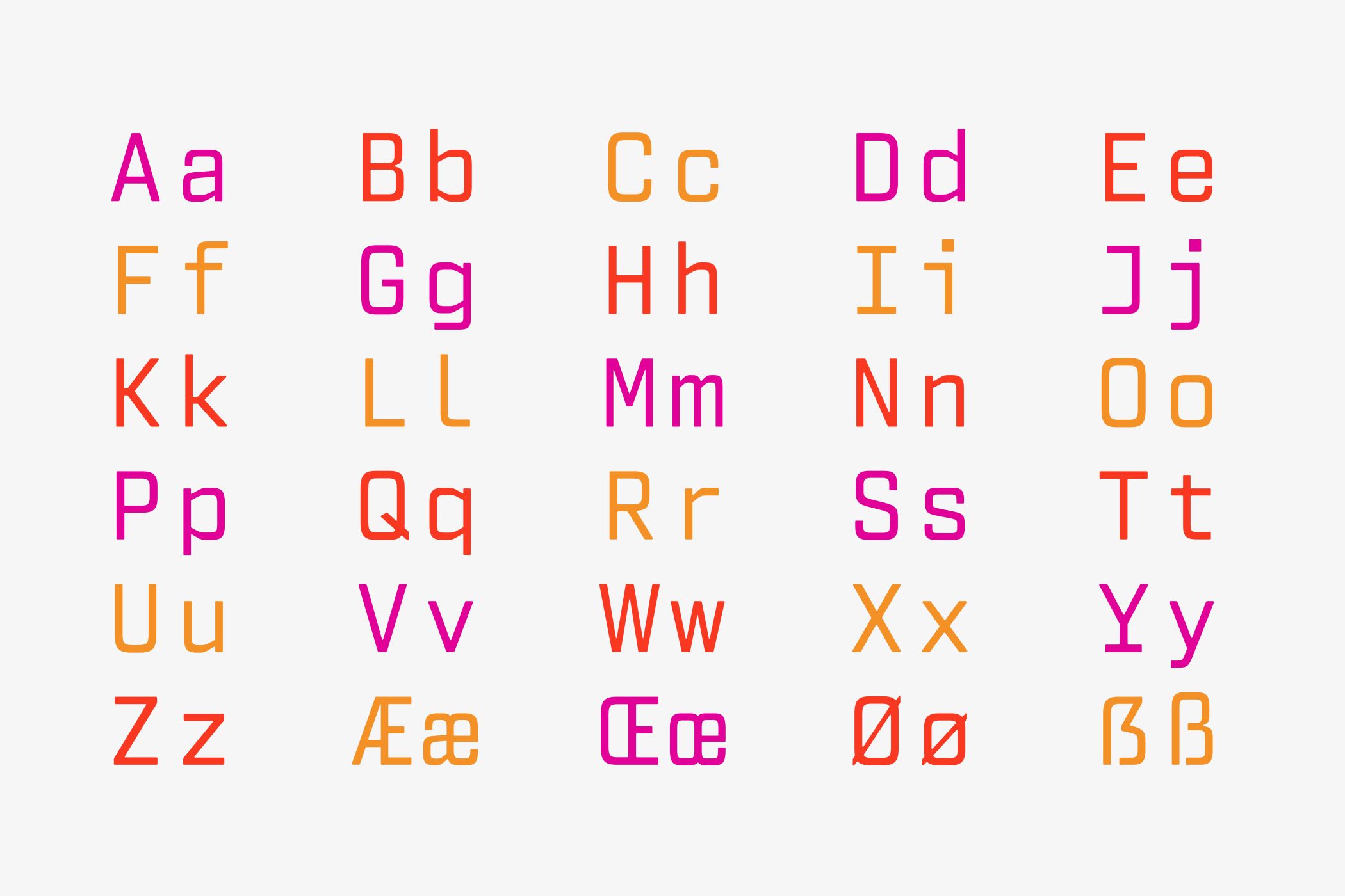

Where miumAccess speaks with warmth, MonoCode
responds with precision. Together they form a
typographic dialogue between people and
technology—balancing emotion and logic,
intuition and structure.
Great Type Design begins by understanding
people. The rest is simply drawing letters.

Brand Strategy, Brand Identity by Claus Koch™
Font Production by Alphabet